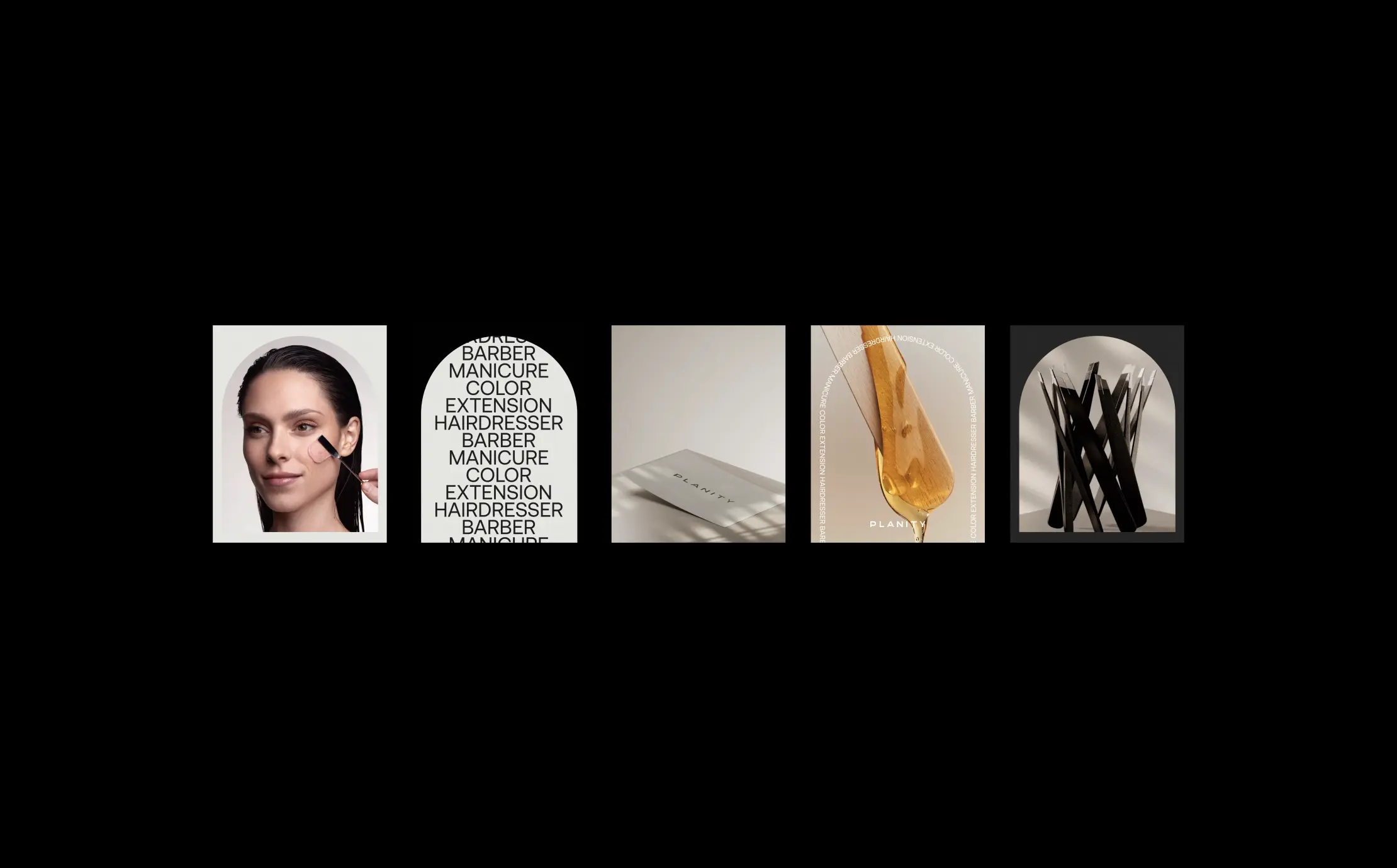
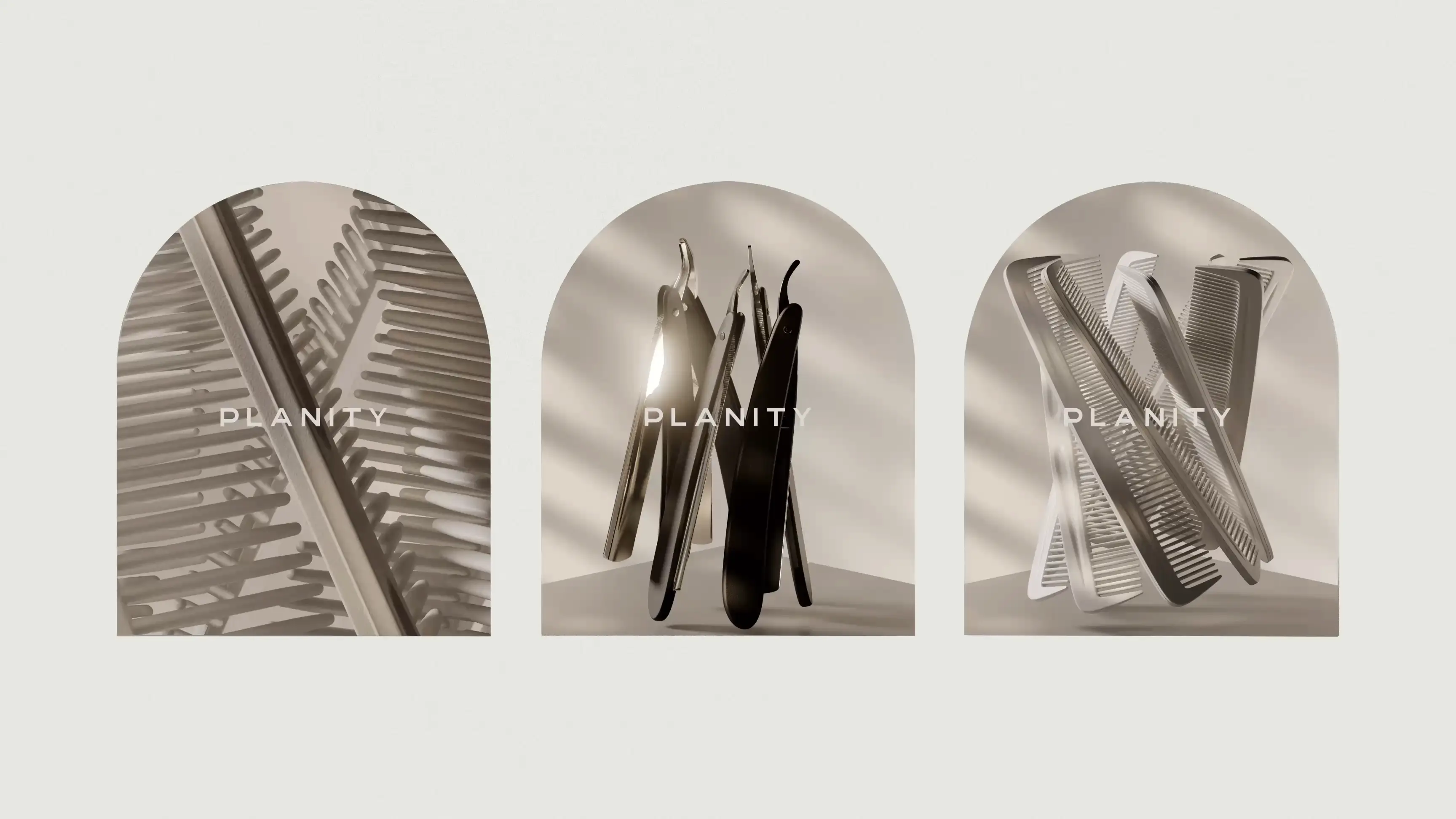
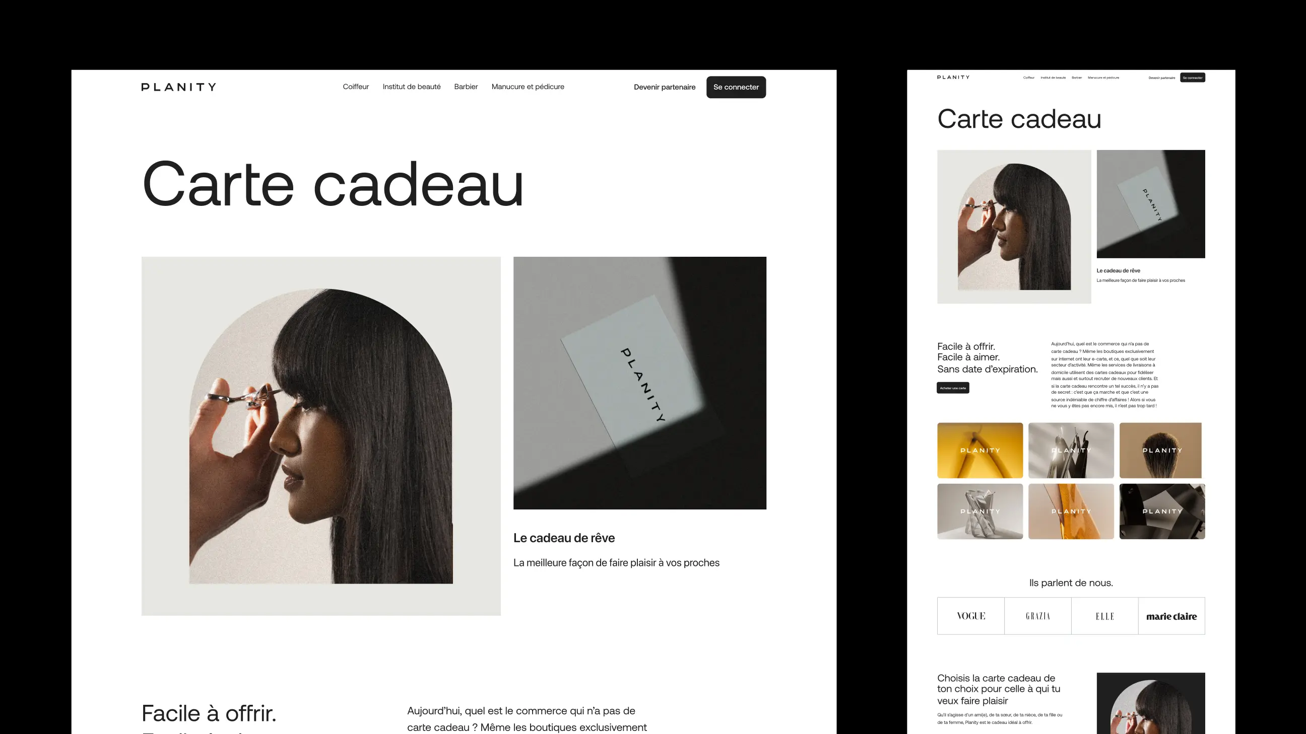
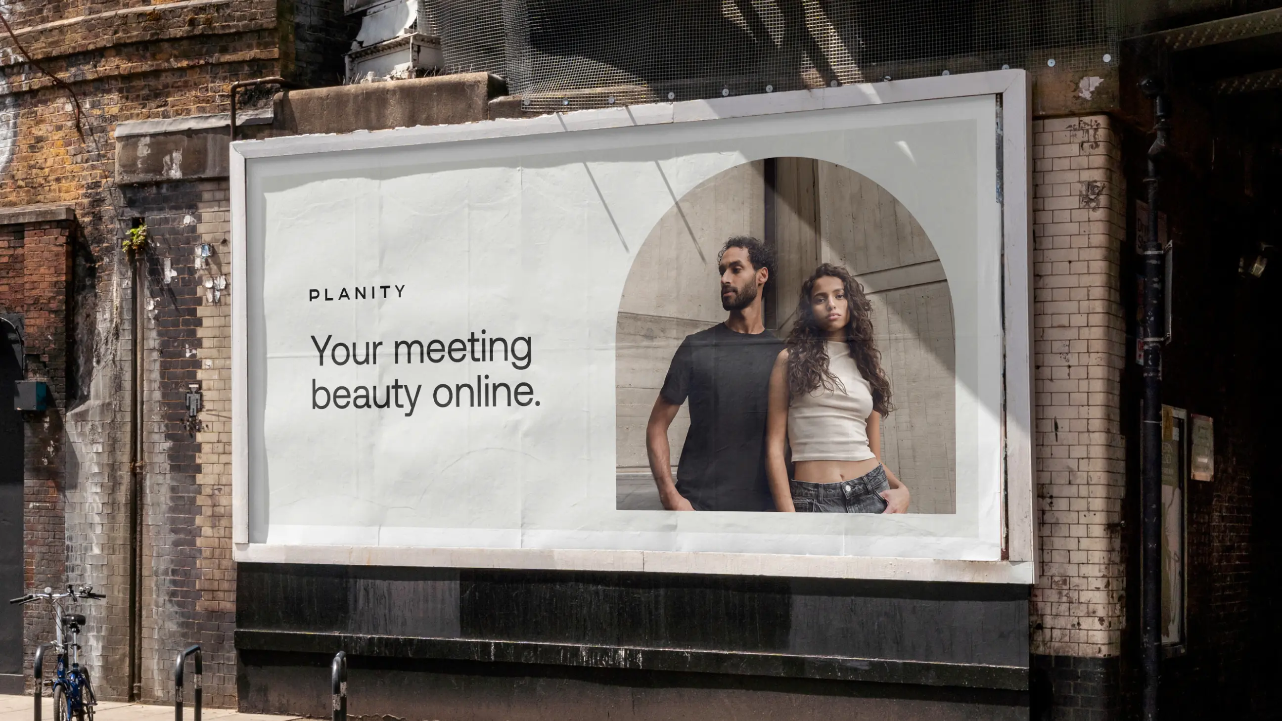
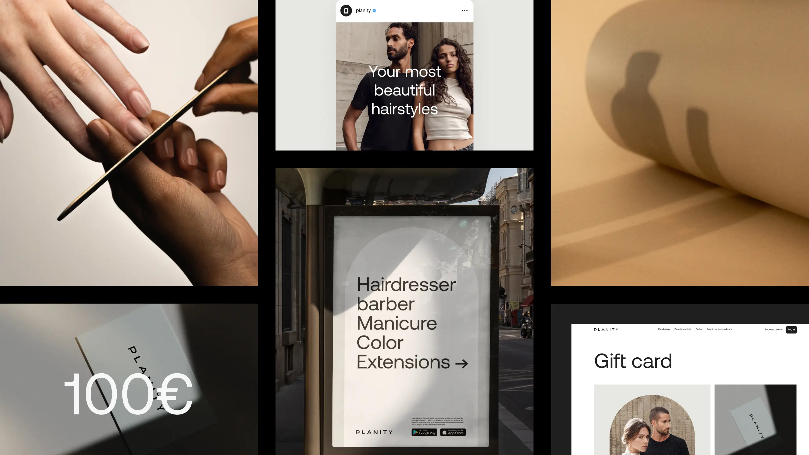
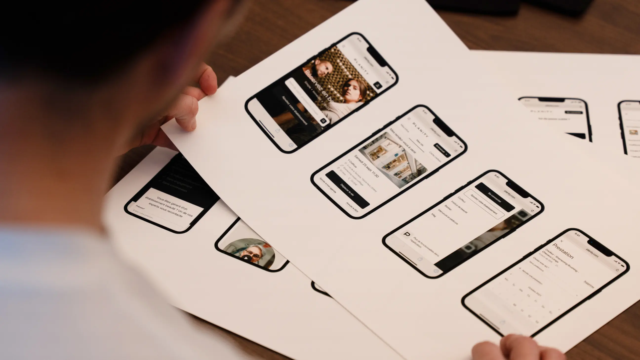
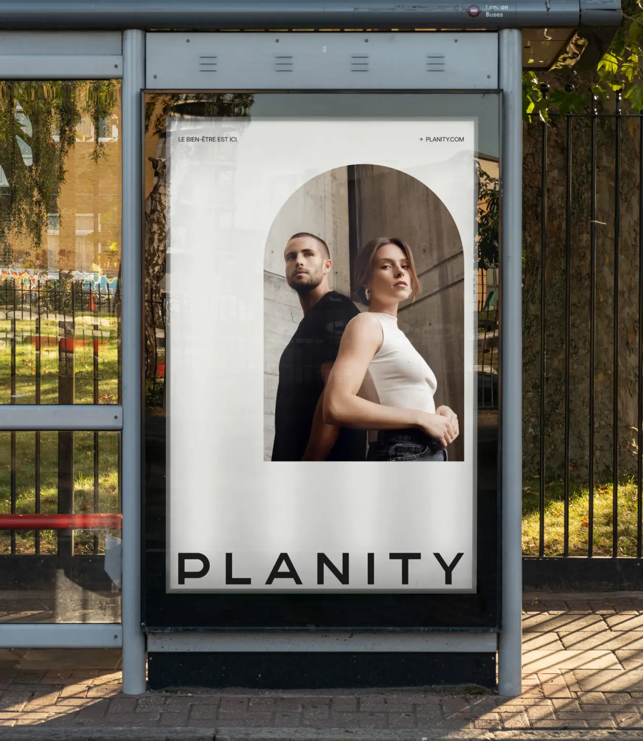
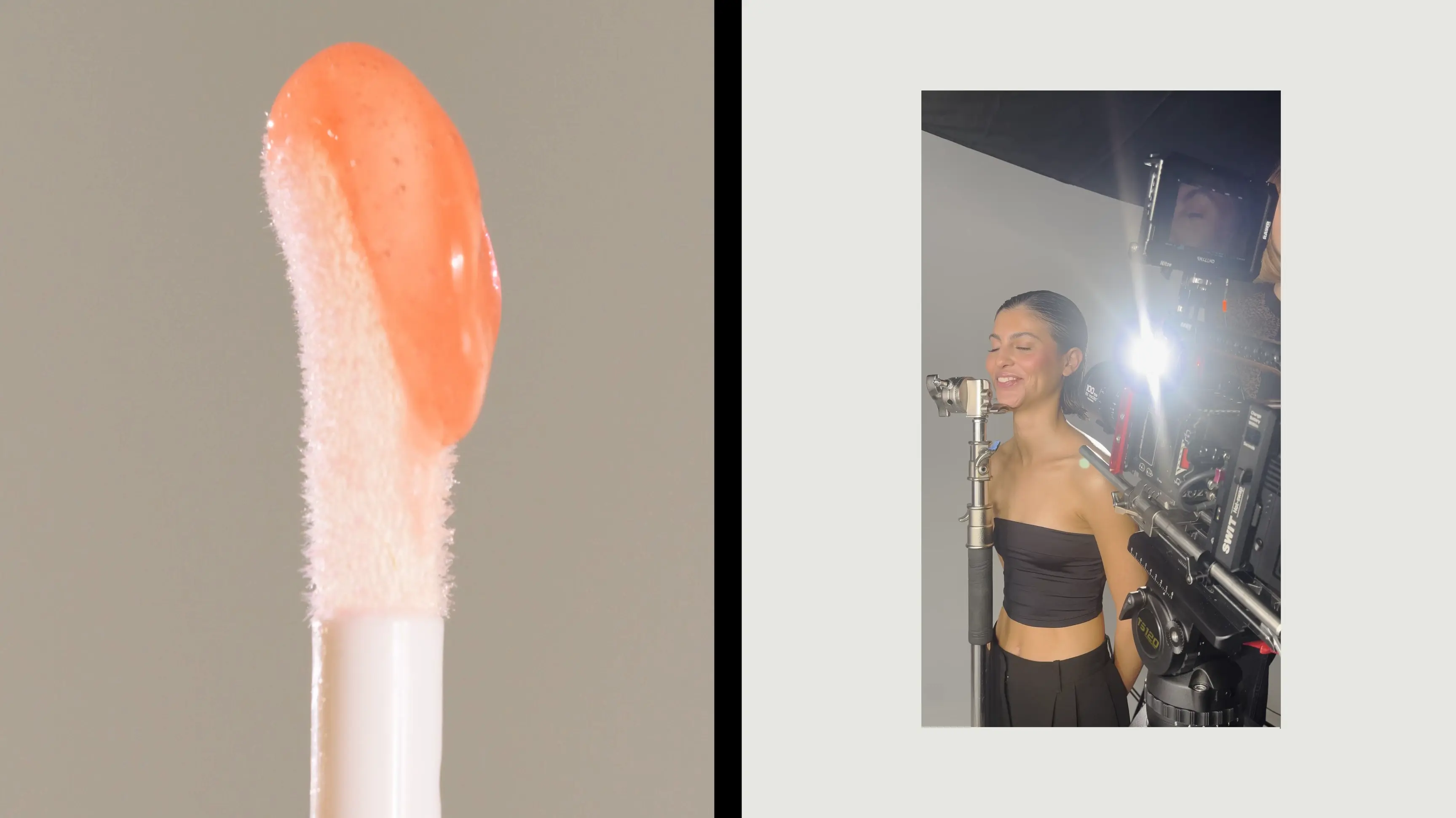
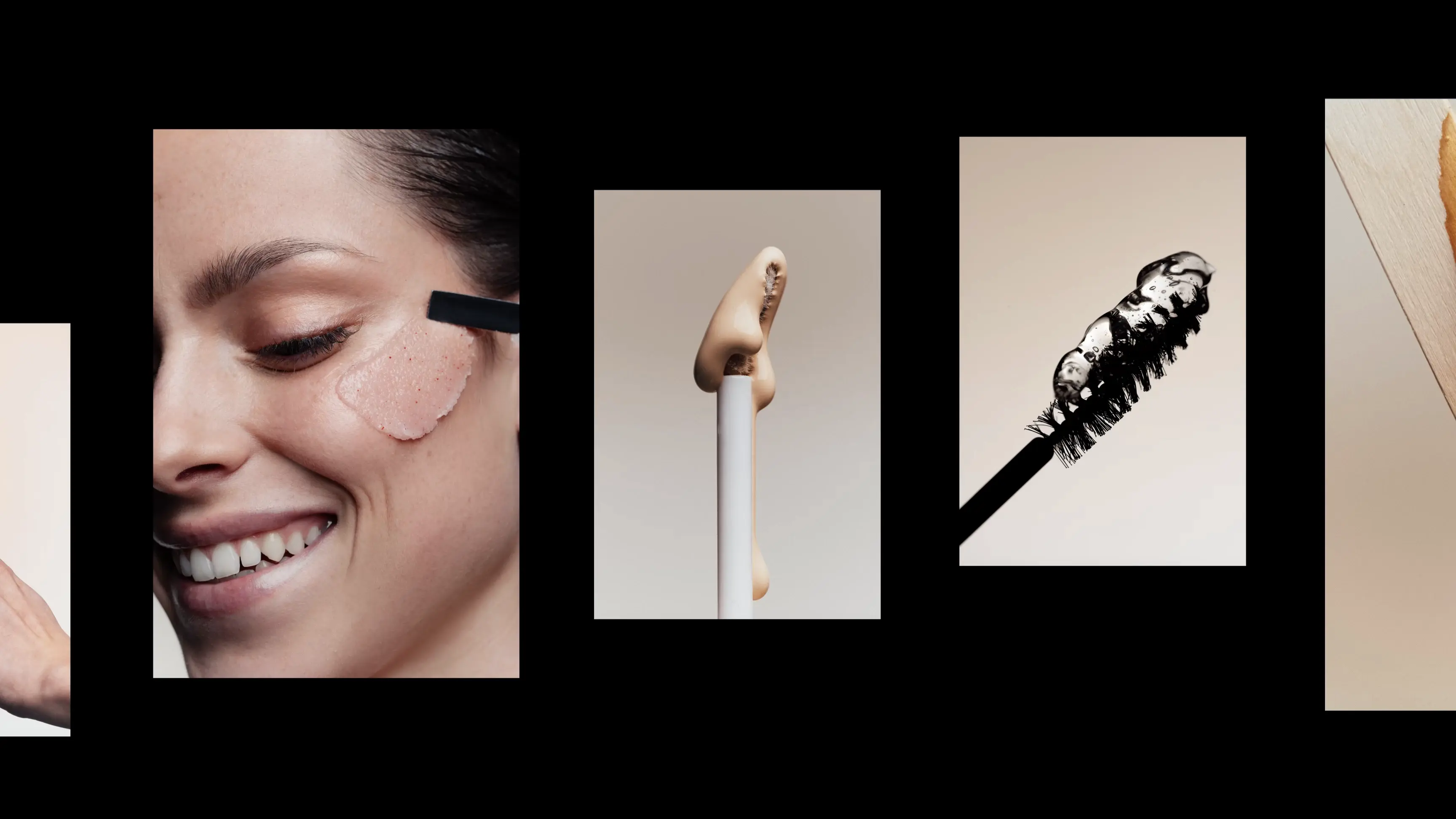
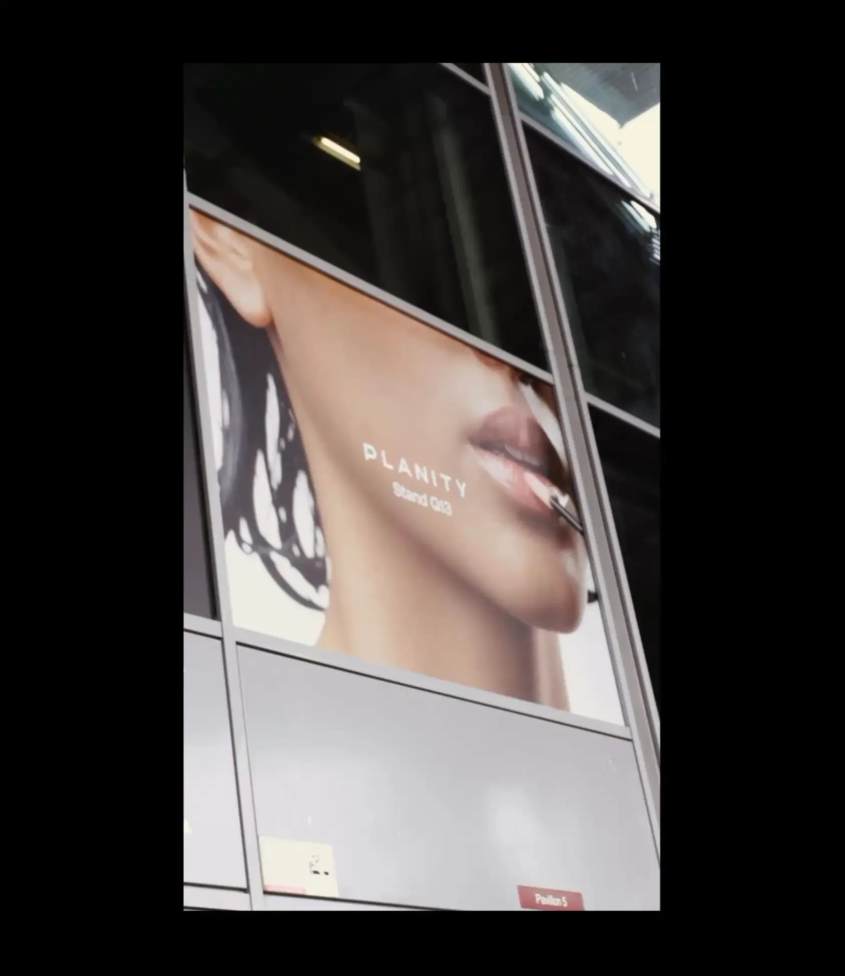
Brand application
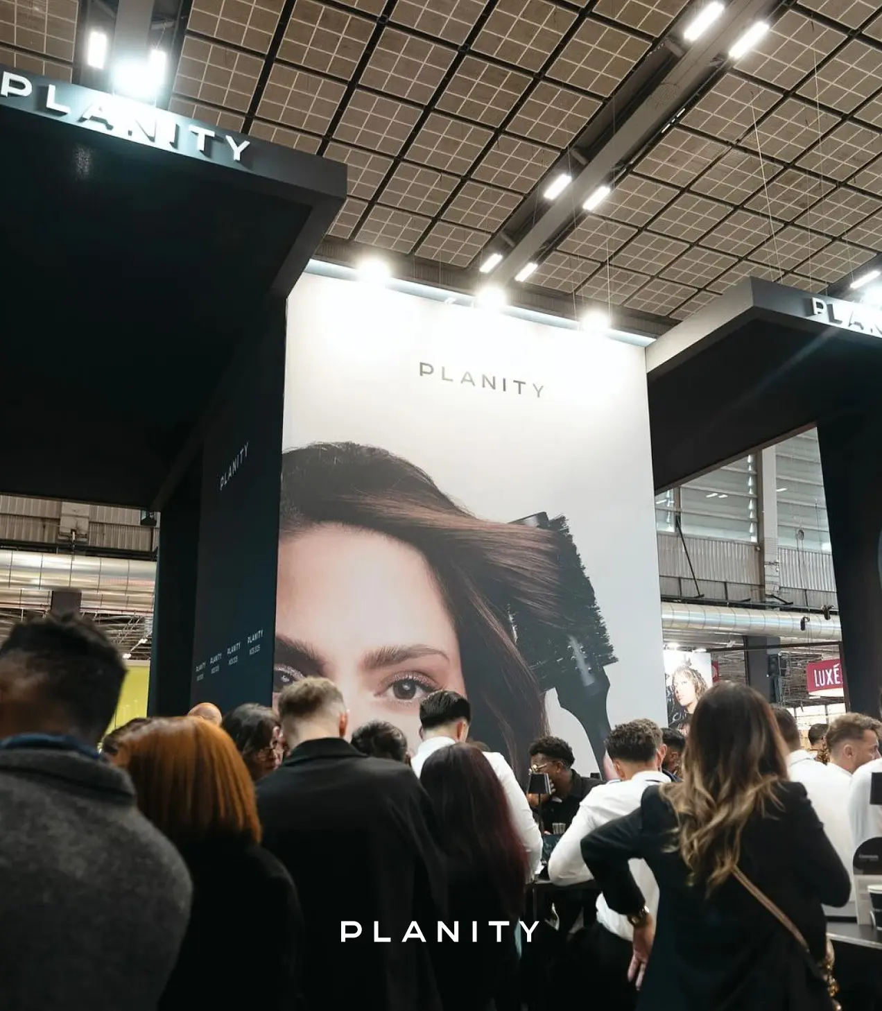
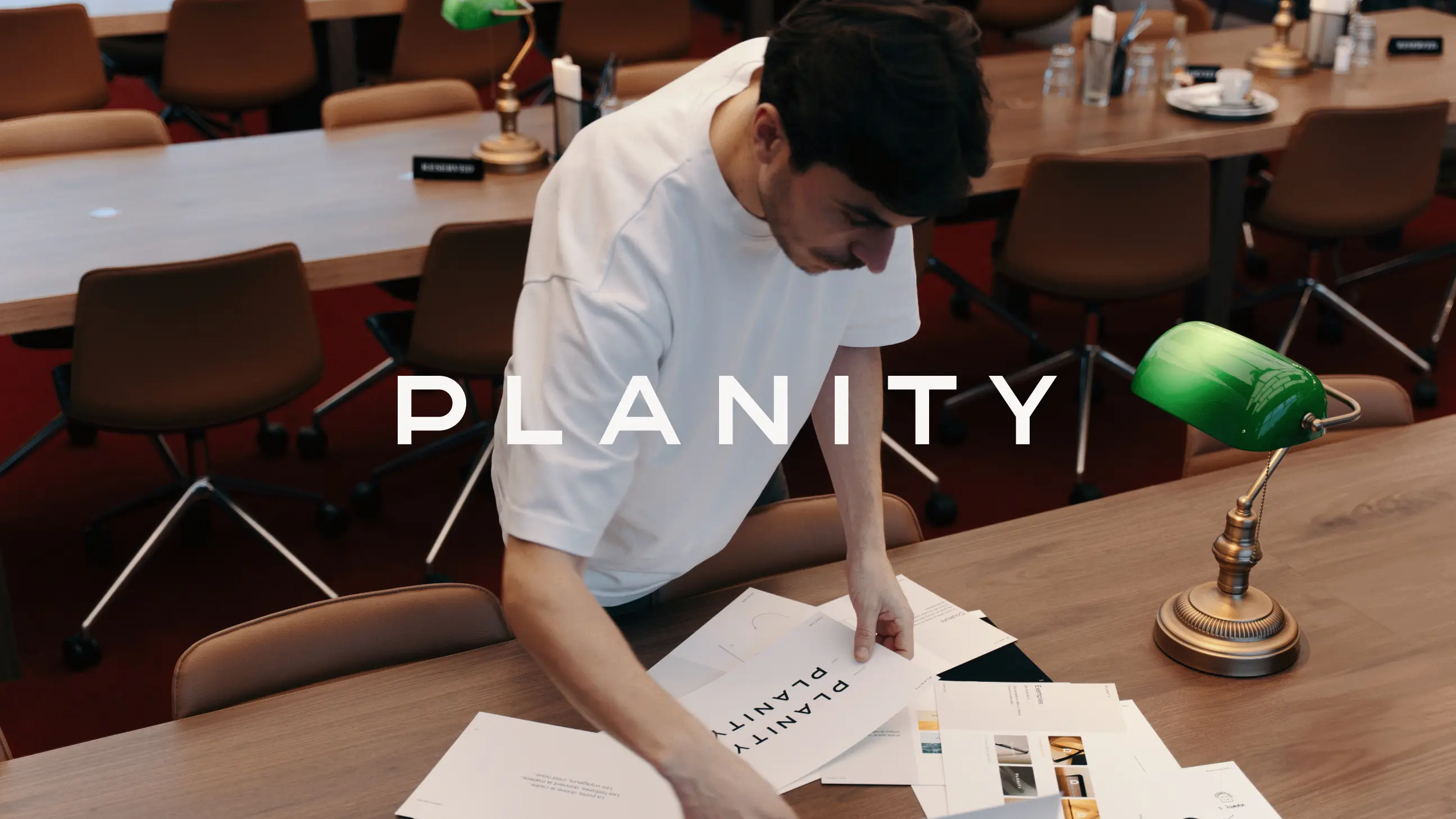
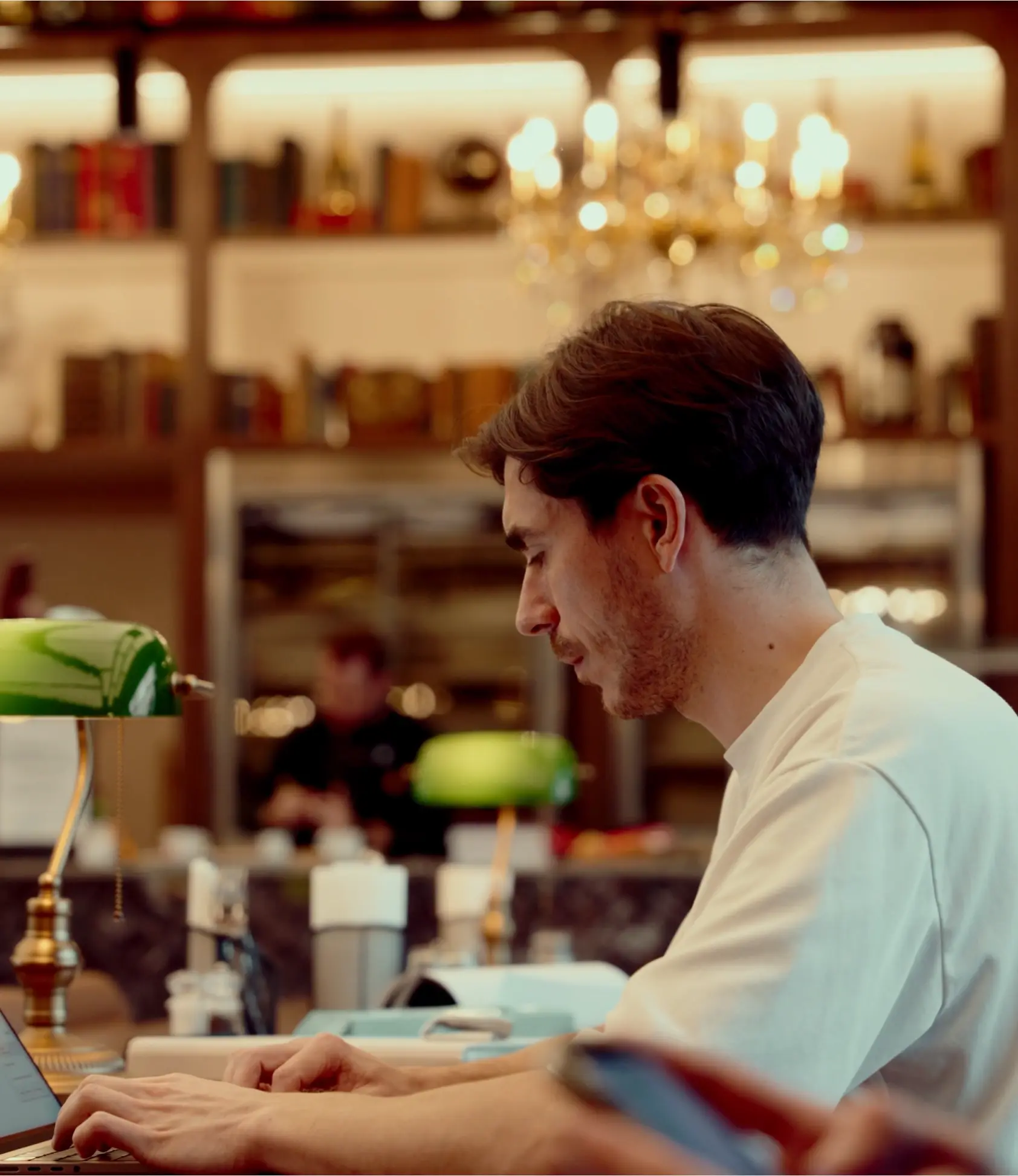
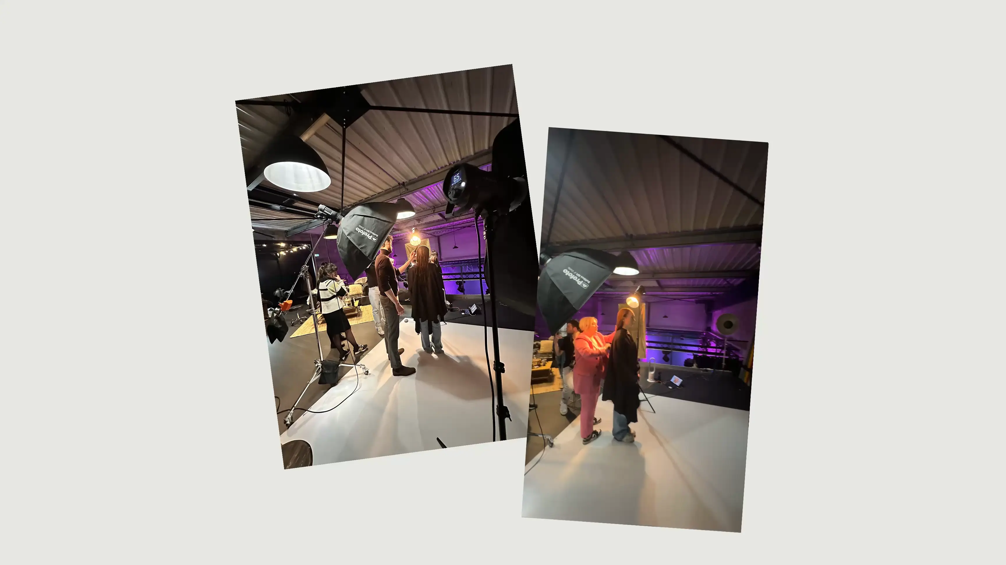
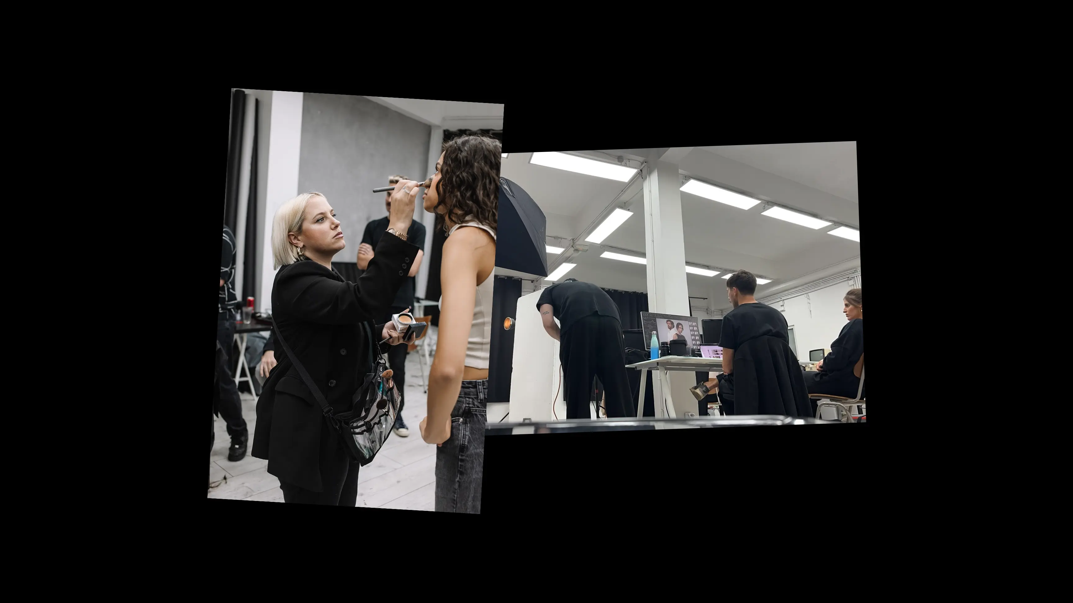
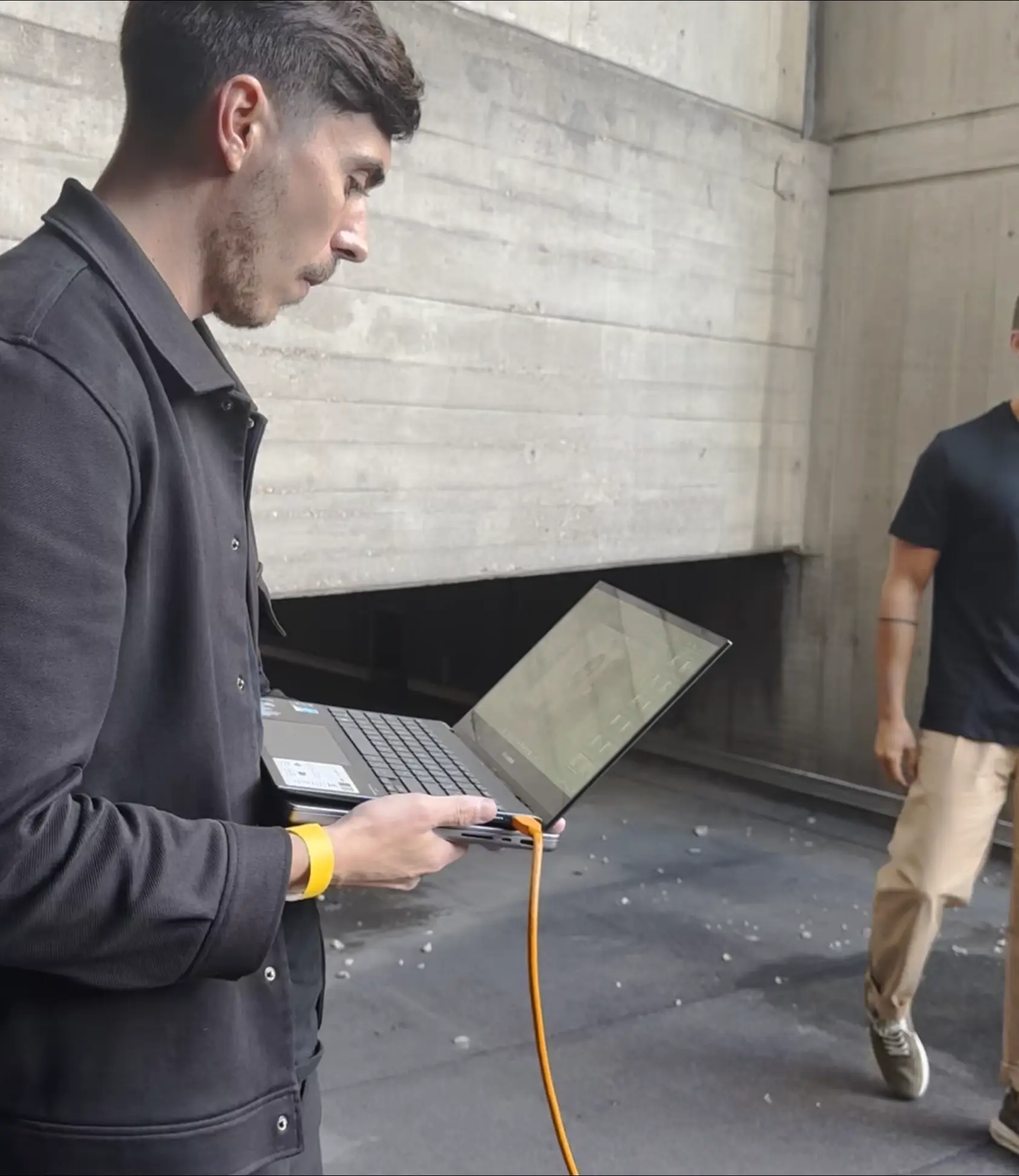
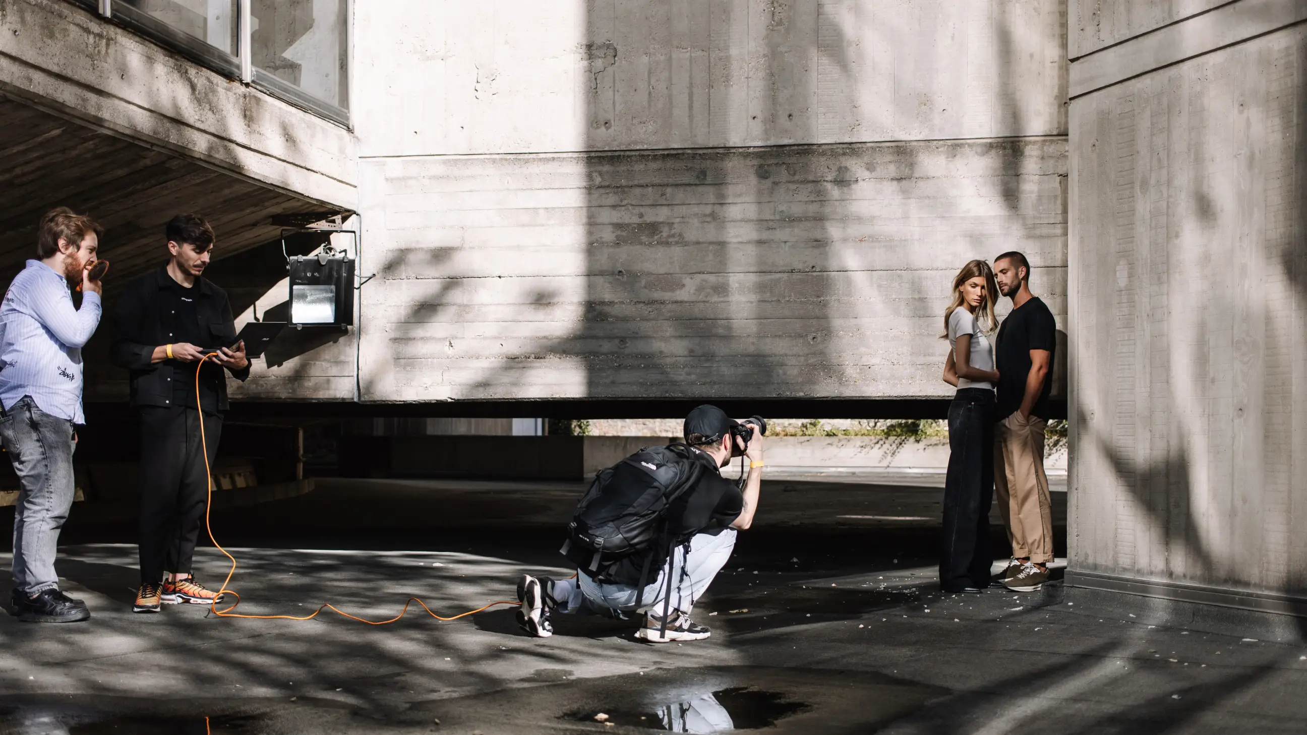
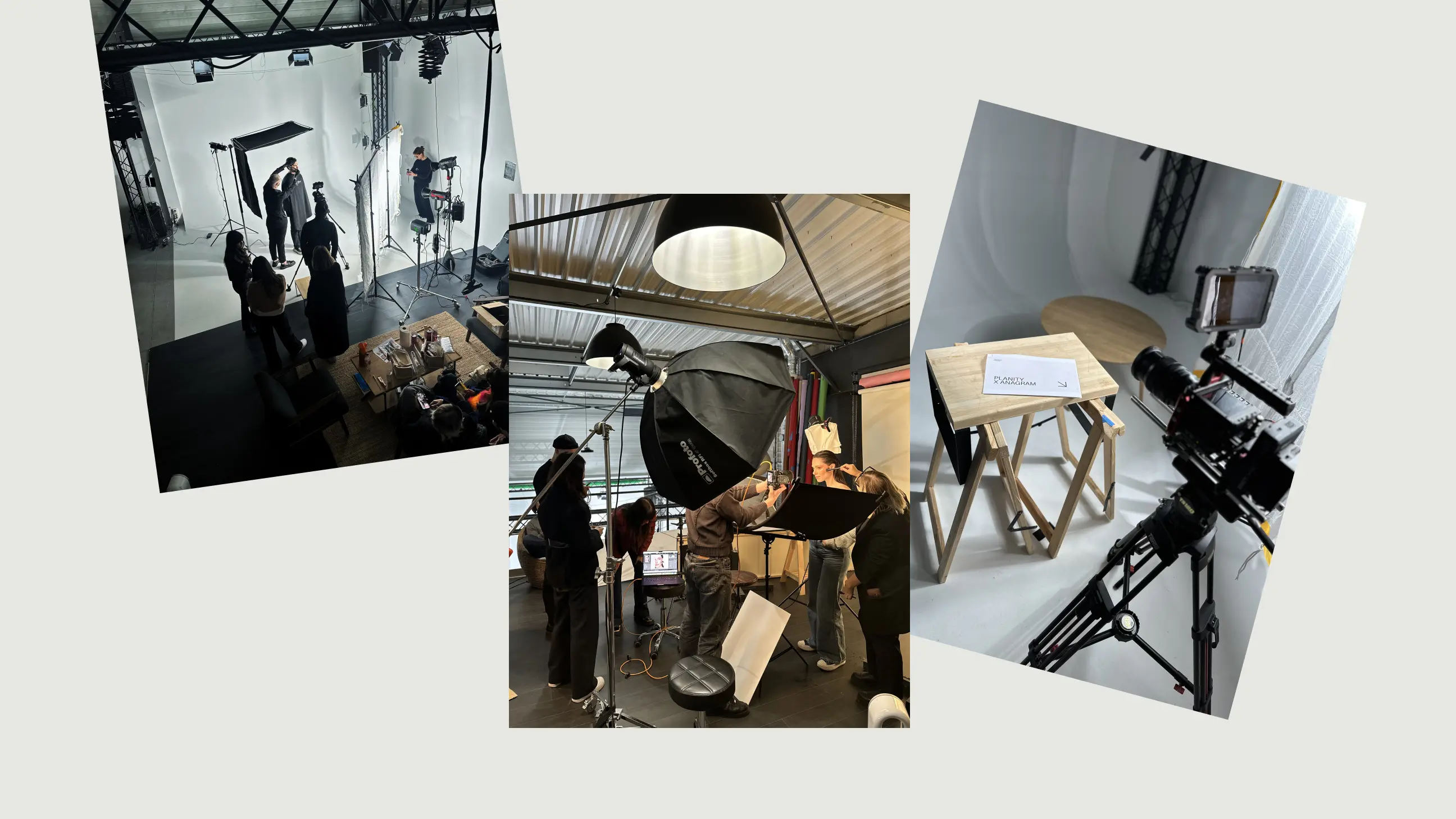
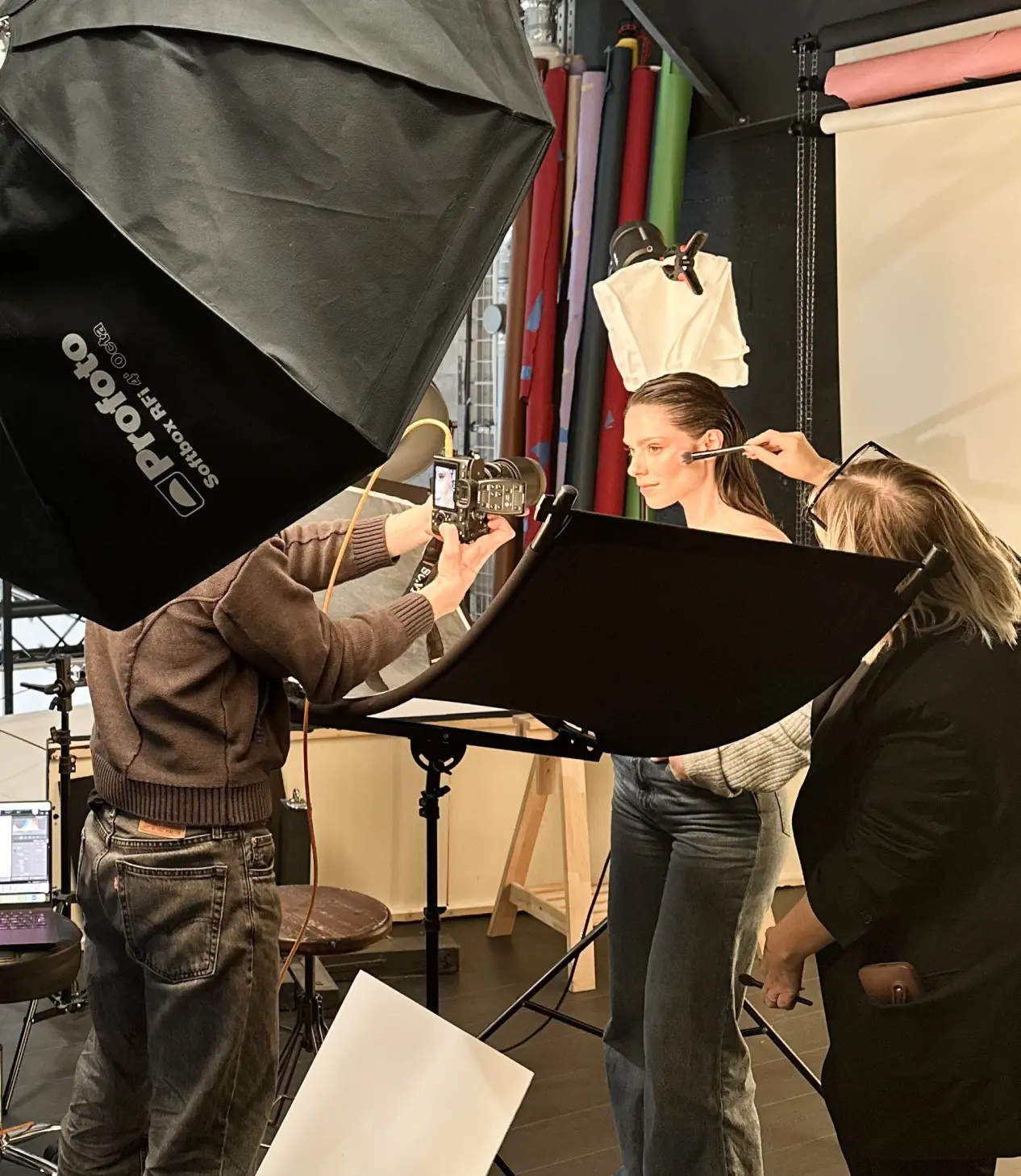
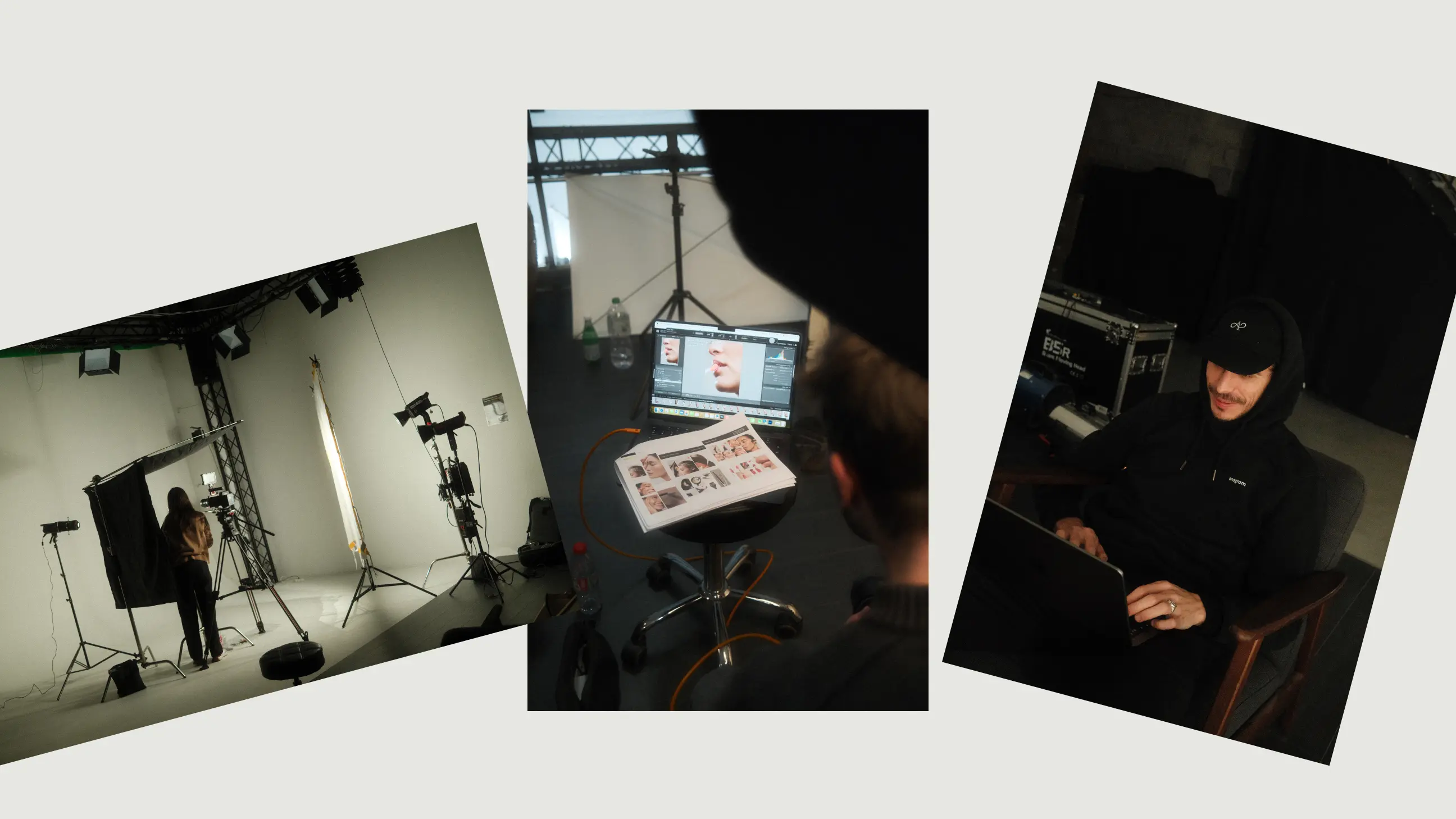
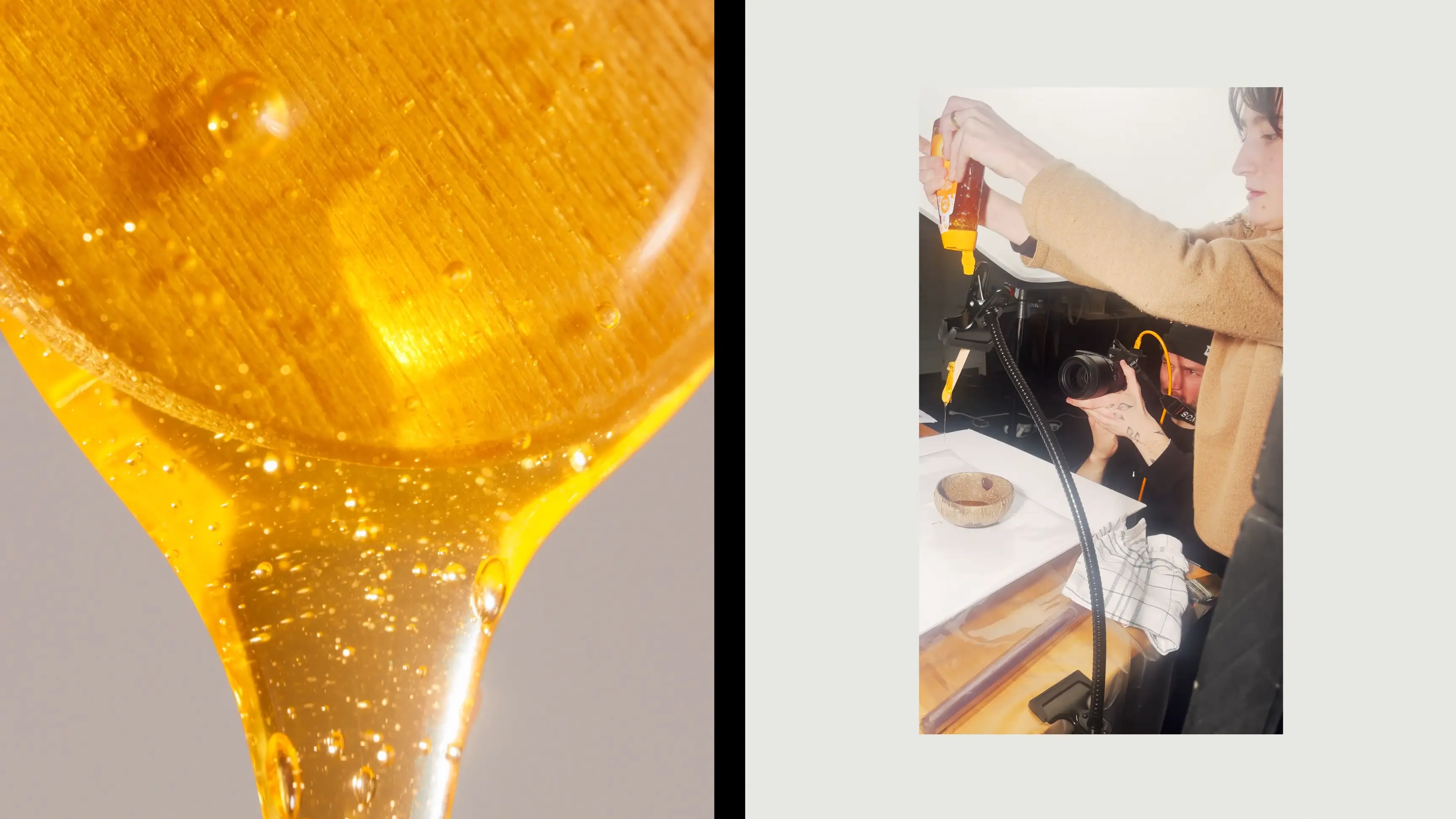
Behind the scene


.webp)
Team
The team behind this project
Global direction
Valentin Salmon, Emmanuel Julliot
Project management
Emmanuel Julliot
Strategy
Emmanuel Julliot
Creative direction
Valentin Salmon, Emmanuel Julliot, Anthony Velen
3D Design
Anthony Velen, Emmanuel Julliot
Motion Design
Valentin Salmon, Anthony Velen
Interactive Design
Valentin Salmon
UX/UI
Valentin Salmon, Emmanuel Julliot
Production
anagram production
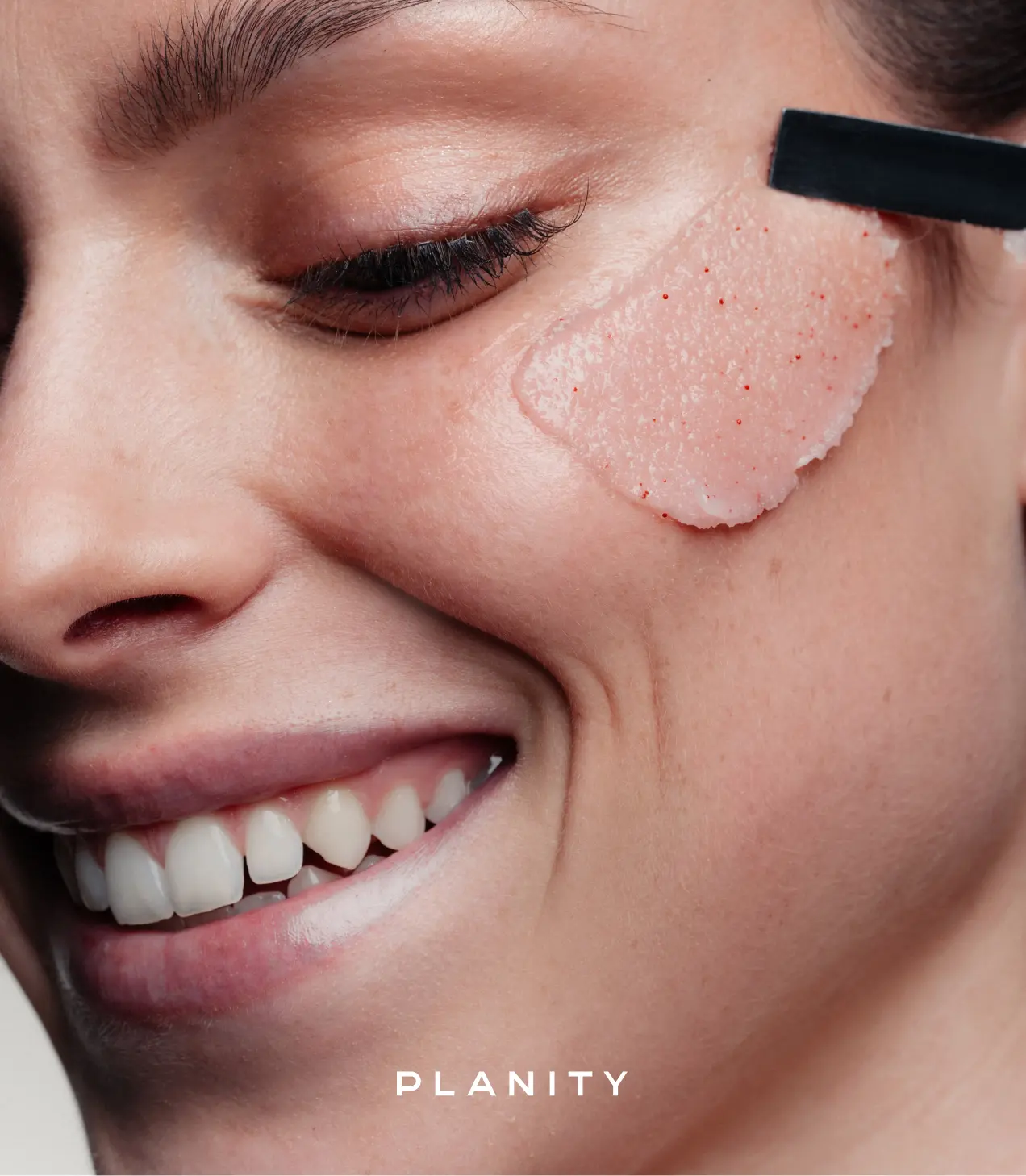
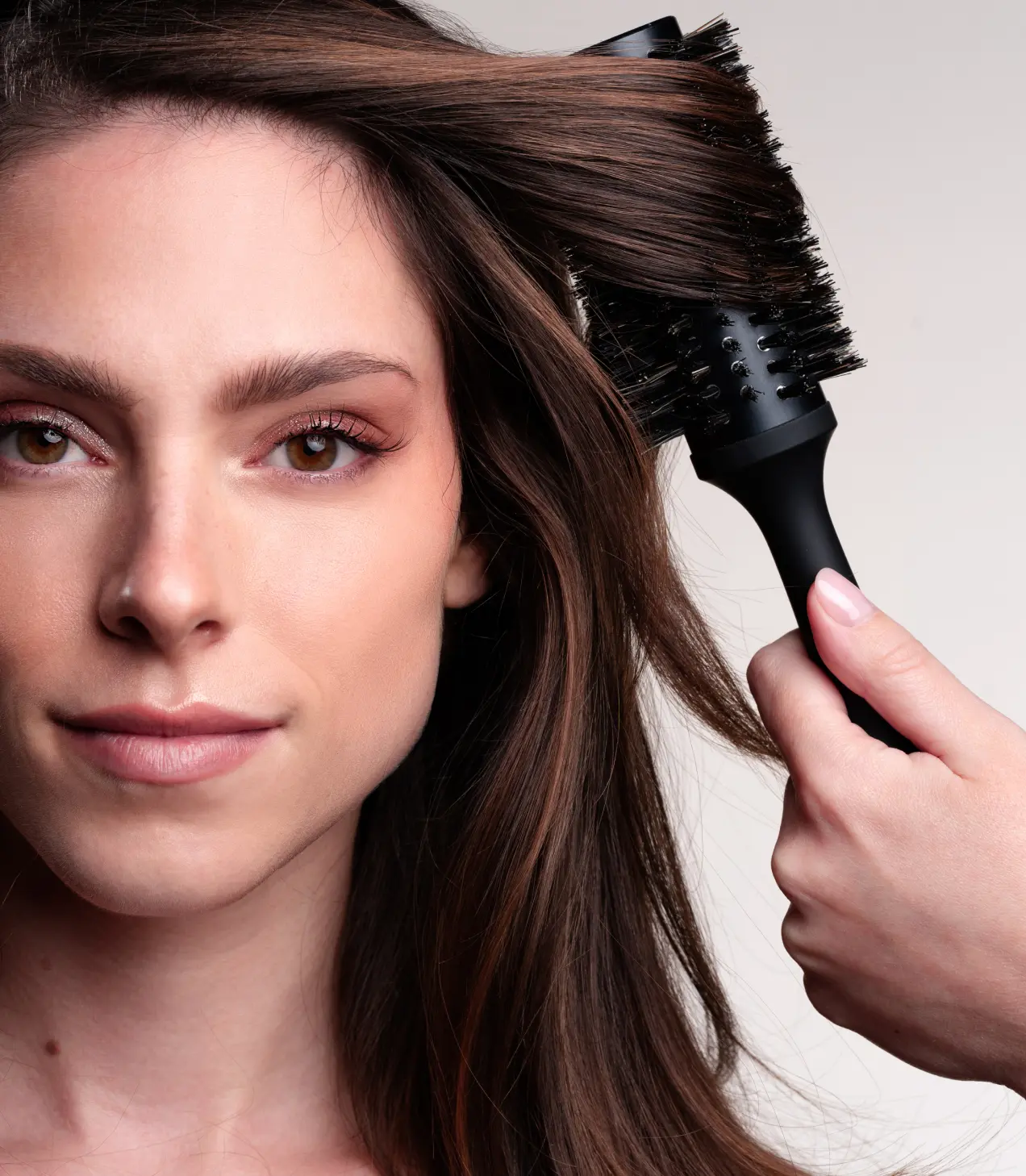
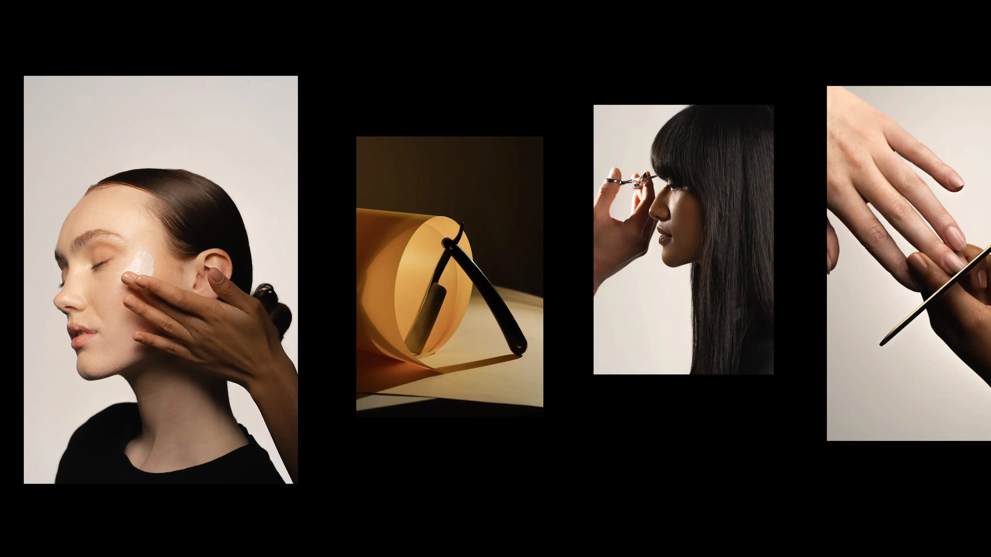
Photography
Sébastien Marchand
Video
Gurvann Touzé
Copywriting
Ameerah Musbally, Camille Guilgaut, Pauline Katz
Integration
Andrea Tuysuzian, Planity
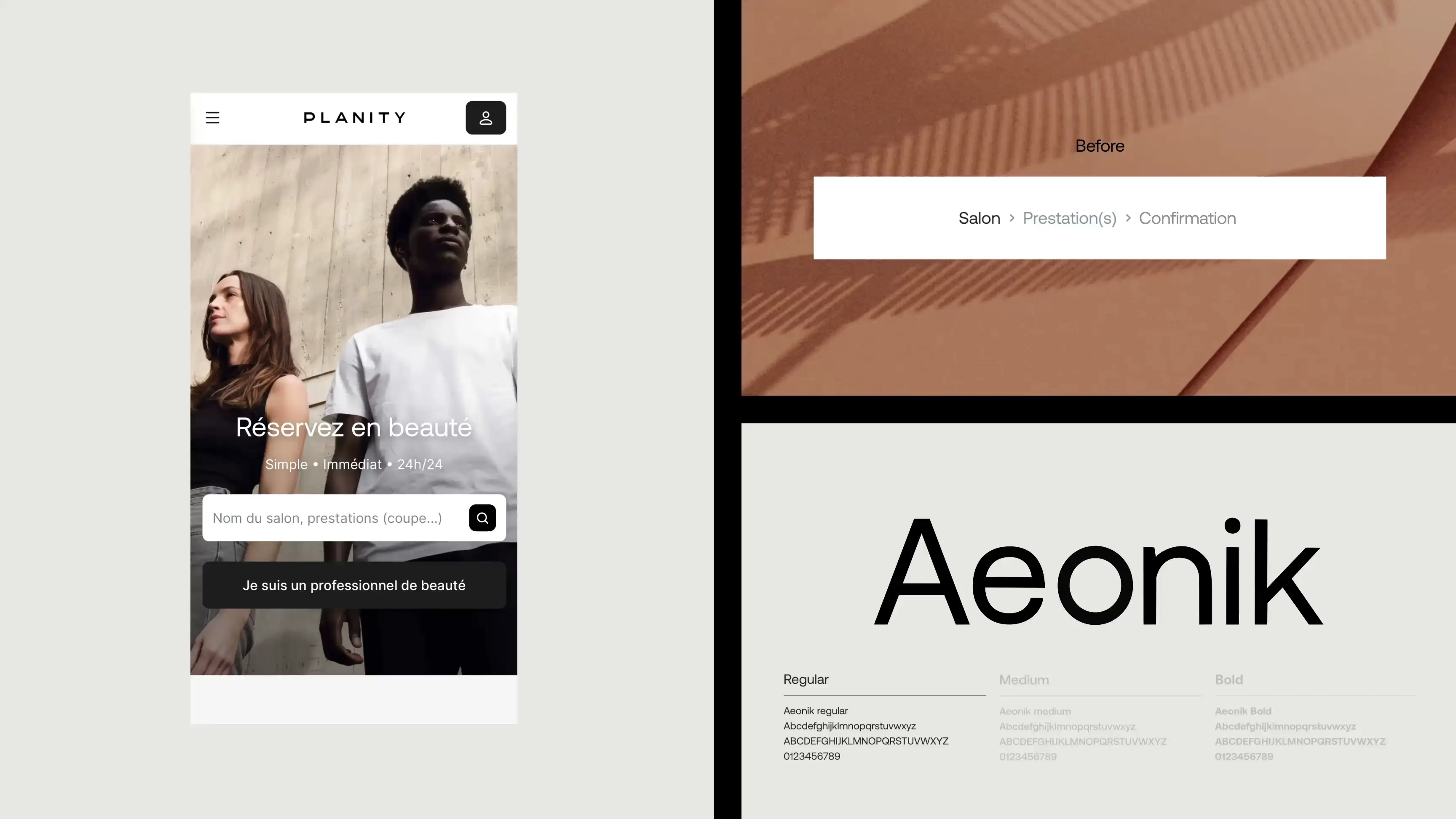
Fonts
Aeonik

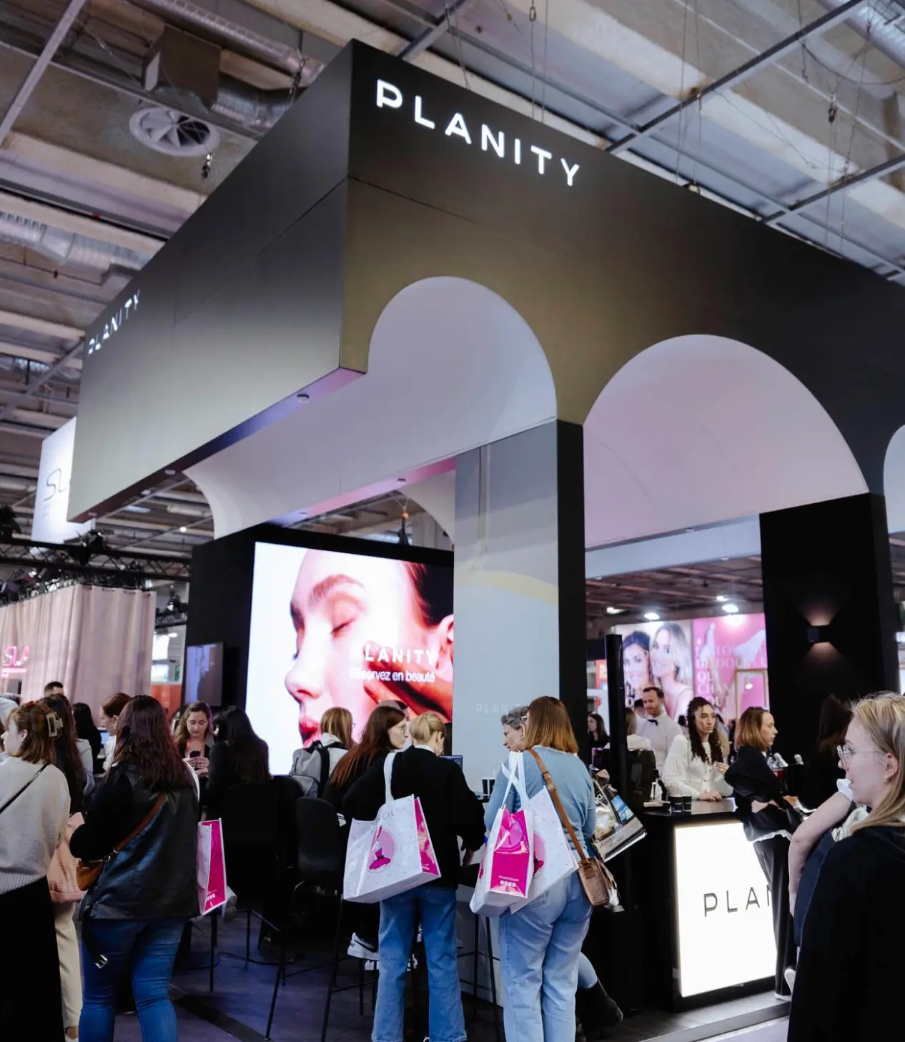
+50%
appointment bookings per second
Team
The team behind this project
Project management
Emmanuel Julliot
Production
anagram production
Photography
Sébastien Marchand
Photography assistant
Camille Poildessous
Video
Gurvann Touzé
Set design
Pénélope Torres
Lighting
Gurvann Touzé
Makeup artist
Allison le Fur
Hairdresser
Dylan Lebahy, Gabin Ahmed
Barber
Aldrick Quéval
Stylist
Camille Poildessous, Ameerah Musbally, Camille Guilgaut, Pauline Katz
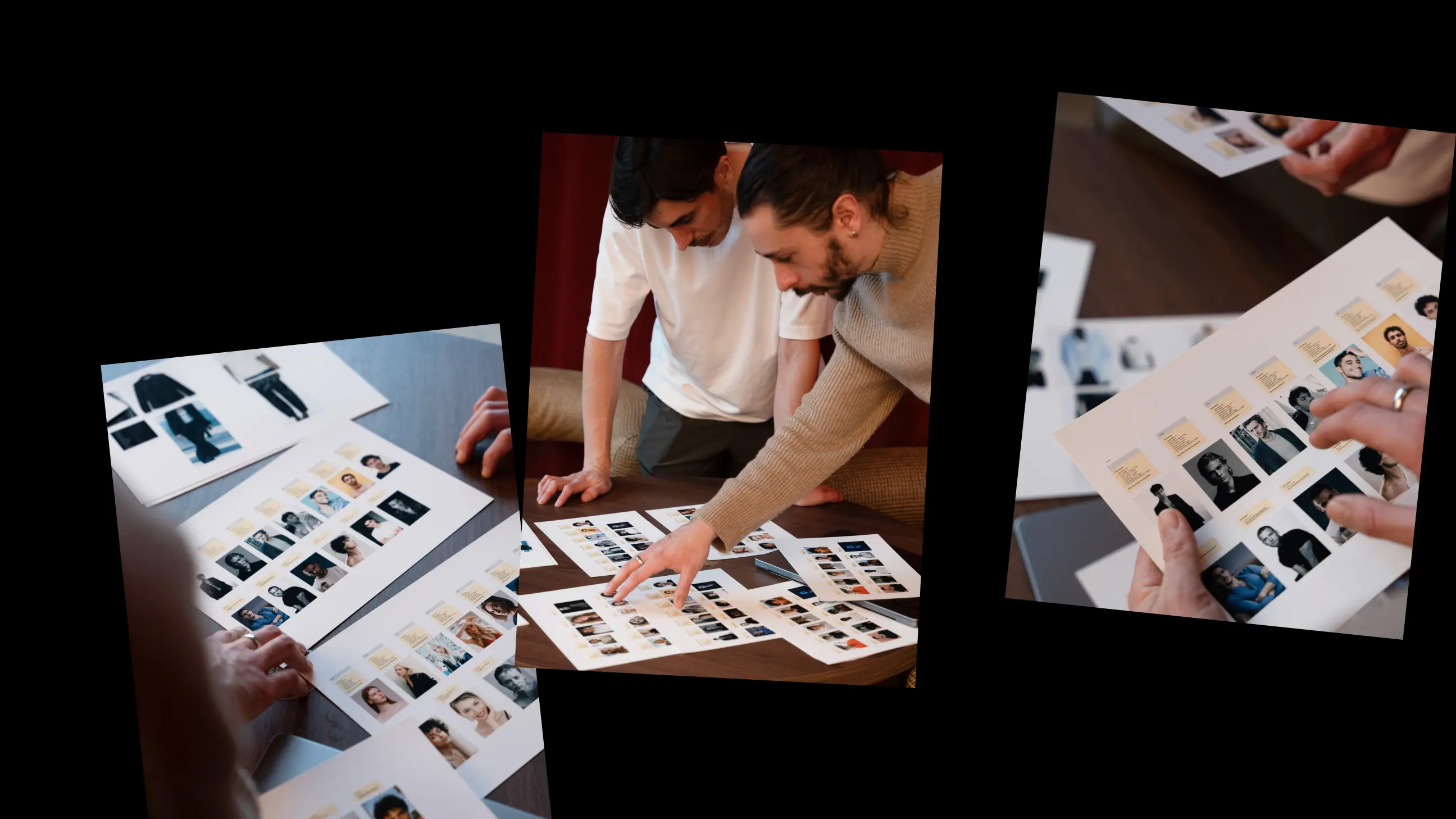
Models
Marion Delorme, Yéro Mbow, Shannon Durand, Valentin Soares, Anthony Lewis,
Agathe Fournier, Wissal Baroudi, Faiz Mahmoud, Nahil Mahmoud, Triana Muñoz,
Lucas Meslet, Fanny Andriamasy, Silvestri Alan, Louann Pinel
Agathe Fournier, Wissal Baroudi, Faiz Mahmoud, Nahil Mahmoud, Triana Muñoz,
Lucas Meslet, Fanny Andriamasy, Silvestri Alan, Louann Pinel
Client
Ameerah Musbally, Camille Guilgaut, Antoine Puymirat, Pauline Katz, Chiraz Hassen,
Jérémy Queroy
Jérémy Queroy
Thank you! Your submission has been received!
Oops! Something went wrong while submitting the form.