Built for recognition
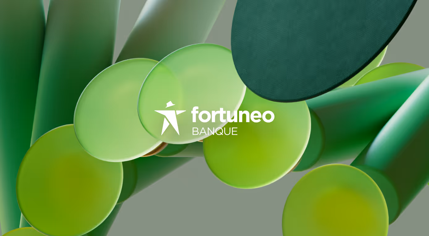
Fortuneo
Transform Fortuneo into a more desirable brand while preserving what makes it unique: being France’s most affordable online bank.
To fuel its next growth phase, the brand refreshed its image to attract younger users with the Fosfo card and increase premium adoption with the Black Card. The challenge was to balance a premium and expert positioning while remaining price led.
The ambition was a clear promise that feels premium yet accessible, competitive yet human, and always free.
Omnia
Omnia is the system behind how brands show up in AI.
Built for a world where answers replace links, it helps companies understand, monitor, and influence their presence across AI-generated search.
Inspired by Ariadne’s thread, the brand is designed around clarity and direction turning complex data into a clear path from insight to action.
Direct and confident, the identity focuses on outcomes over noise, positioning Omnia not just as a tool, but as the layer of control in how brands are seen, understood, and chosen in the age of AI.
Semplice
Elevate Semplice’s new release through motion.
The challenge was to showcase a product built for designers with clarity and precision, highlighting each feature without overcomplicating the experience.
We crafted a presentation film focused on motion, designed to reveal interactions, details and key functionalities in a fluid and engaging way.
The result is a clear and compelling narrative that enhances product understanding and strengthens the perception of the new release.
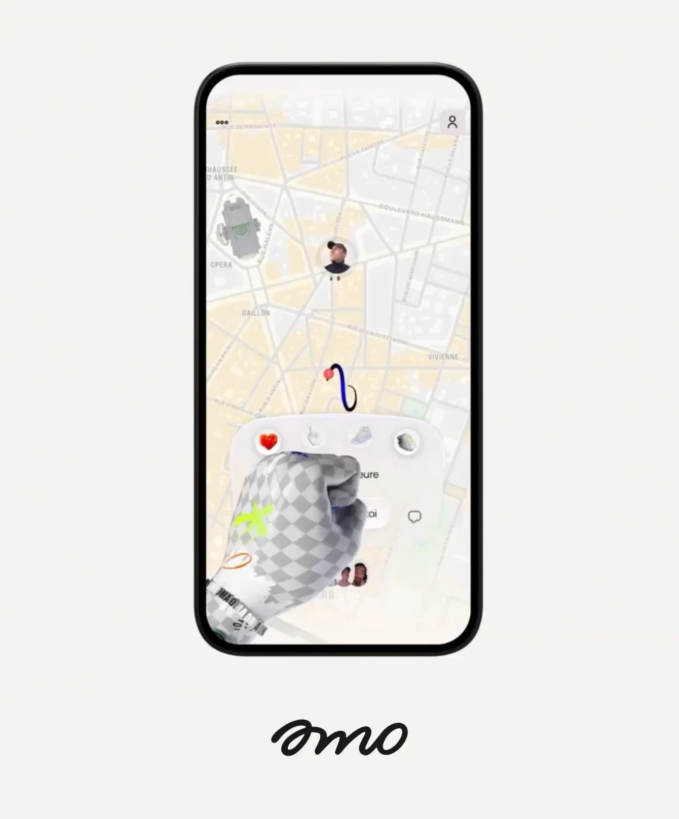
amo
Reimagine social products around real friendships.
Following the success of Zenly, amo was highly anticipated, with the challenge of delivering a new kind of social experience focused on closeness rather than entertainment.
We worked on the early brand and product assets to shape a distinctive and engaging visual universe, designed to create immediate impact at launch and spark user interest.
The result is a bold and expressive foundation that supports amo’s vision, helping the product stand out and reconnect people with those who matter most.
.avif)
Everyday
Create a brand that reflects the idea of daily engagement and positive routine.
Position the studio as both creative and technology driven, combining playful experiences with AI powered innovation.
Design an identity that expresses energy, optimism, and consistency while remaining simple and memorable.
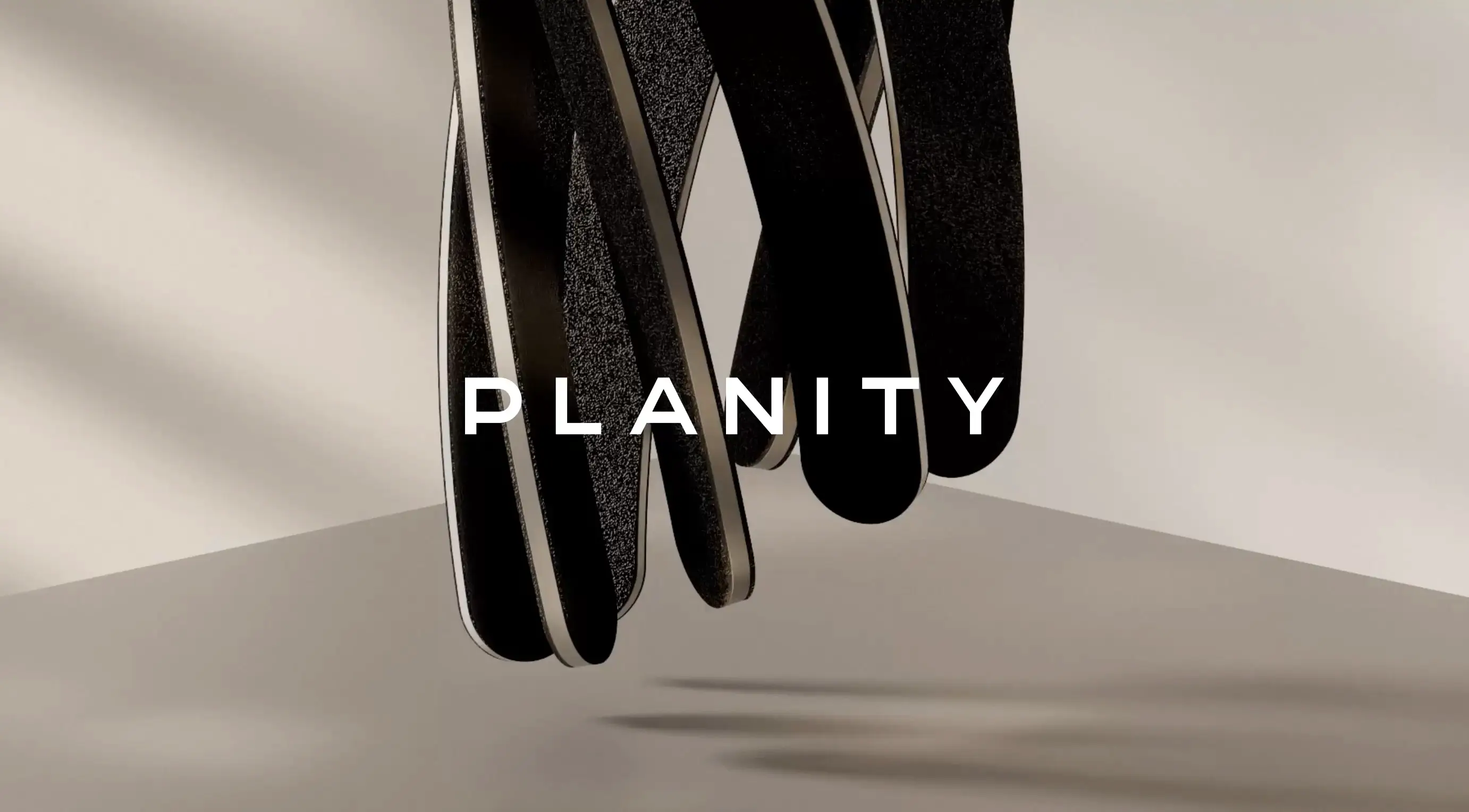
Planity
Simplify the booking experience by reducing friction and improving conversion, while evolving the product beyond a purely functional interface.
Build a stronger, more emotional and distinctive brand aligned with modern beauty codes, capable of supporting B2C adoption, reinforcing the B2B model, and enabling European expansion.
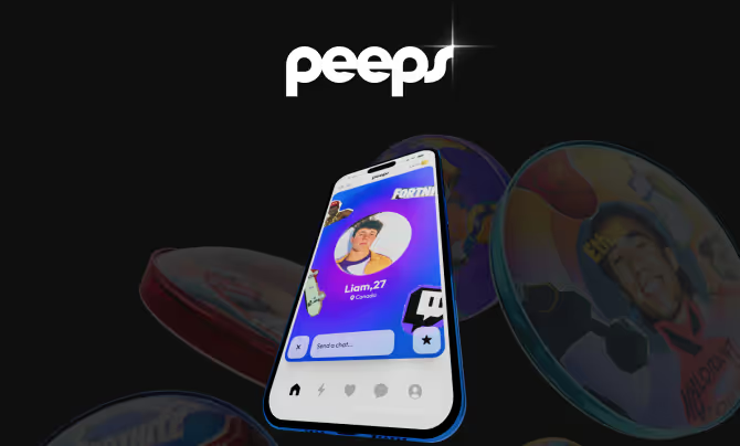
Peeps
Break the cycle of performative social media.
Peeps is a people-first platform designed to help a new generation build real connections, without pressure, judgment or the need to perform.
The challenge was to create a brand that feels safe, expressive and genuinely human, while standing apart from the polished and competitive codes of traditional social platforms.
We developed a soft yet distinctive identity, paired with a conversational and playful tone of voice, shaping a language and system that feel inclusive, relatable and alive.
The result is a brand that resonates deeply with its audience, positioning Peeps as a social space built around authenticity, belonging and real friendships.
Politico
Unify Politico’s digital ecosystem into a faster, more coherent and globally scalable experience.
Following the merger of Politico.com and Politico.eu, the challenge was to align user experience and editorial workflows while maintaining speed and consistency across markets.
We designed a lean, mobile-first system built on a reduced set of components, enabling teams to scale content efficiently and ensure a strong, unified brand presence.
The result is a simpler, more powerful platform that balances editorial curation with real-time news delivery across all audiences.
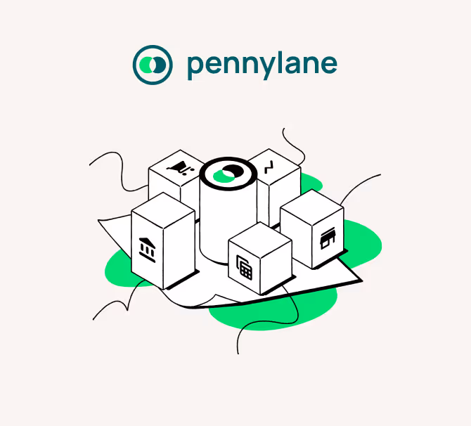
Pennylane
Position Pennylane as a leading financial platform within a highly competitive ecosystem.
The challenge was to differentiate the brand in a crowded market, translating a complex offering into a clear, distinctive and trustworthy positioning.
We developed a brand platform and visual identity that bring clarity and consistency, shaping how Pennylane expresses itself across all external touchpoints.
The result is a stronger, more distinctive presence, reinforcing credibility and driving measurable impact on engagement and conversion.

Henoo
Turn exploration into a social and personal experience.Omnia is the system behind how brands show up in AI.
Henoo helps people reconnect with the world around them by discovering places, activities and moments tailored to their tastes, blending utility with social dynamics.Built for a world where answers replace links, it helps companies understand, monitor, and influence their presence across AI-generated search.
The challenge was to create a brand that feels both inspiring and familiar, positioning Henoo as a trusted companion rather than just another discovery app.Inspired by Ariadne’s thread, the brand is designed around clarity and direction turning complex data into a clear path from insight to action.
We designed a warm and expressive identity, along with a distinctive character, to embody the product’s voice and create an emotional connection with users.
The result is a brand that inspires action, making discovery feel effortless, personal and deeply engaging.

Founders Future
Clarify the brand’s positioning in a competitive global investment landscape, strengthen credibility with founders and stakeholders, and build a visual and narrative system capable of supporting international growth.
The goal was to evolve from a purely financial image to a more strategic, human, and future-oriented presence.
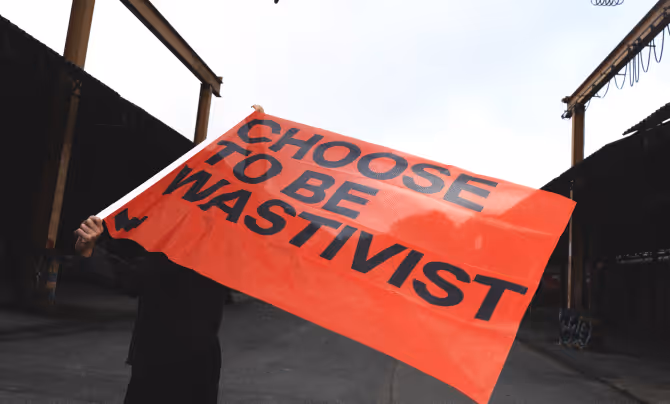
Wastetide
Wastetide reframes waste as untapped value.
Built on the belief that nothing is truly discarded, the brand positions industrial waste as a resource. A hidden asset waiting to be captured, optimized, and monetized.
The identity embraces this shift with a bold, unapologetic tone. Direct and business-driven, it moves away from traditional “green” narratives to focus on performance, efficiency, and return.
More than a sustainability play, Wastetide is about turning what’s ignored into impact and what’s wasted into profit.
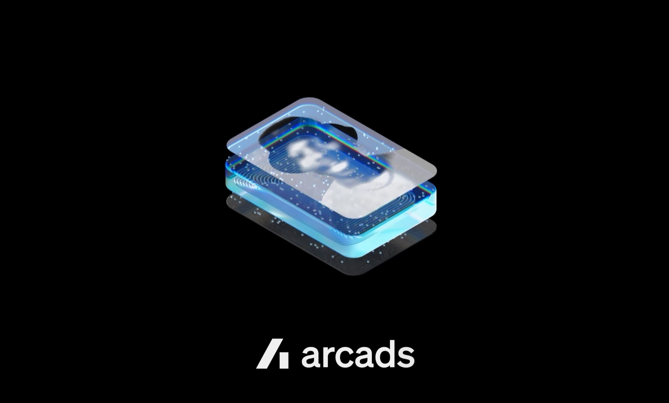
Arcads
Position Arcads as a new standard for AI-powered advertising.
The challenge was to clarify a complex and emerging offering, helping brands understand they can create high-performing ads using AI-generated talent.
We refined the brand to express both performance and accessibility, building a clear and confident positioning within a highly competitive landscape.
The result is a sharper, more understandable brand that highlights tangible outcomes, making the value of AI-driven advertising immediate and compelling.
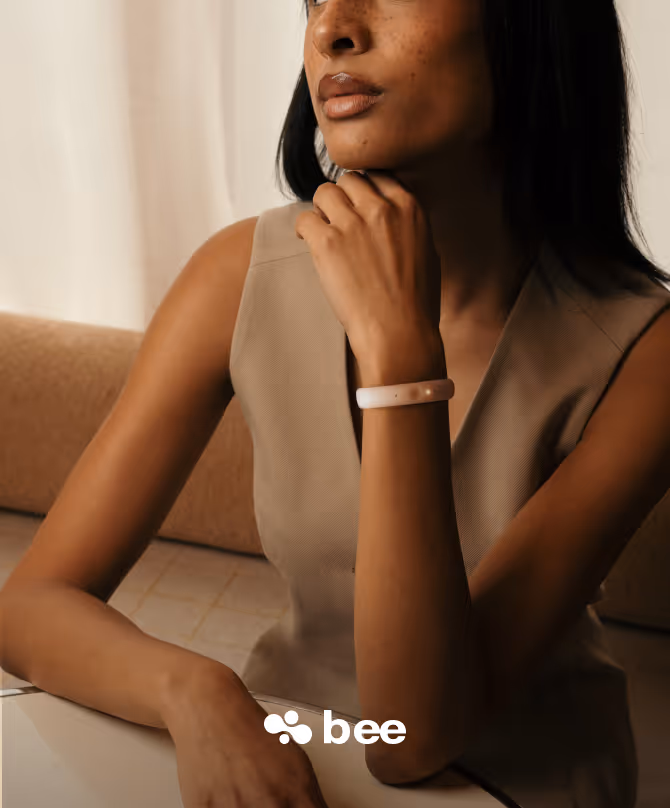
bee
Reimagine personal computing through an always-on, ambient AI.
Bee captures conversations and context in real time, turning them into insights, summaries and reminders that evolve with you.
The challenge was to make an invisible technology feel both useful and trustworthy, while simplifying a complex AI system into a clear product experience.
We designed a calm and minimal brand that reflects a system working quietly in the background.
The result is a new kind of personal interface built around memory, awareness and time.
.avif)
Inbolt
Redefine industrial automation through real-time vision-guided robotics.
Inbolt enables robots to see, think and adapt in real time, removing the need for rigid infrastructure and unlocking a new generation of flexible automation across factory floors.
The challenge was to translate a deeply technical product into a clear and compelling brand, capable of expressing both cutting-edge performance and real-world usability.
The result is a brand that makes advanced robotics tangible and accessible, positioning Inbolt as a new standard for adaptable, real-time automation.
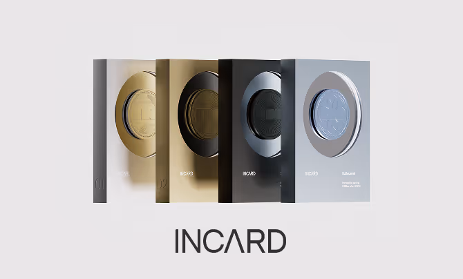
Incard
Incard turns banking into a tangible experience.
We designed a collection of nine cards across metal, plastic, and mirrored finishes, each crafted as an object of identity rather than a simple payment tool.
Beyond the cards, we extended the system into a series of trophies awarded to users as they reach key milestones within the app, transforming progress into something visible and collectible.
The result is a brand that elevates everyday transactions into a system of status, recognition, and engagement, where financial interactions become part of a broader, rewarding experience.
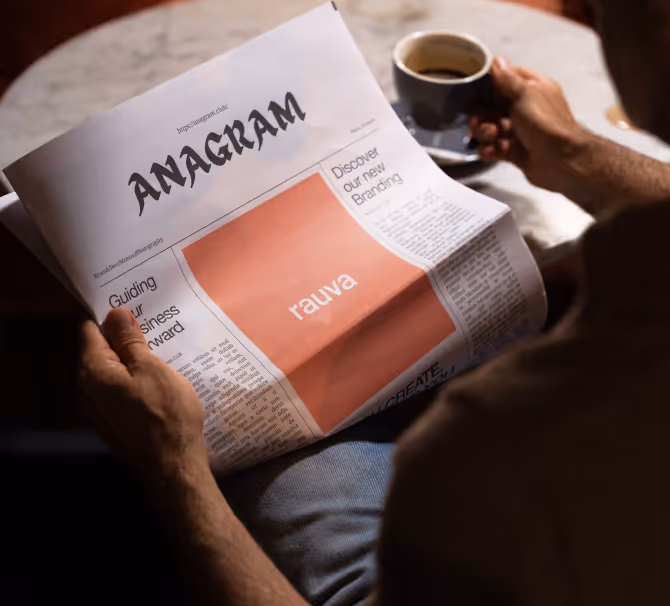
Rauva
Rauva simplifies business.
Designed as an all-in-one platform, it brings together everything entrepreneurs need to start, manage, and grow their company in one place. From banking to invoicing to accounting, the experience removes friction at every step.
We built the brand around clarity and control. A system that feels unified, efficient, and accessible, reflecting a product that replaces complexity with flow.
More than a fintech, Rauva becomes the operating system for modern entrepreneurs.
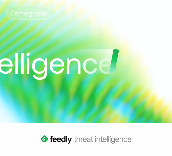
Feedly
Feedly transforms information into actionable intelligence.
We built the brand around the idea of luminous intelligence, the ability to bring instant clarity to highly specific data in a world saturated with signals.
Clear, structured, and confident, the identity makes complex information feel immediate and usable.
More than a monitoring tool, Feedly becomes a layer of intelligence, helping teams stay ahead, anticipate change, and act with confidence.
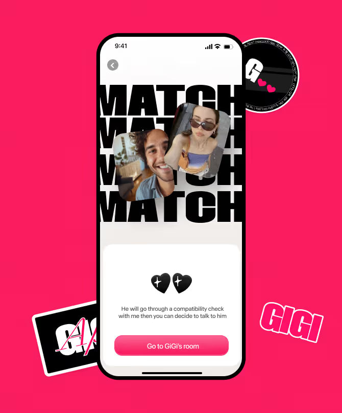
Gigi
Reinvent matchmaking through a bold, AI-driven experience.
In a saturated and declining dating market, Gigi challenges conventions with a new approach blending AI, social signals and storytelling.
The challenge was to create a distinctive brand and product that stand out instantly, while making the experience feel playful, intuitive and desirable.
We designed both the brand and mobile experience, crafting a vibrant and expressive identity that captures Gigi’s personality and sets it apart from traditional dating apps.
The result is a fresh and engaging product that redefines how people connect, positioning Gigi as a new kind of matchmaker for a new generation.
Perma
Turn photography into a lasting act.
Perma is a photo exchange network where documentation becomes intentional, creating shared memories that resist the fleeting nature of digital content.
The challenge was to build a brand that stands against ephemerality, while fostering a sense of exchange, community and belonging.
We developed a bold and minimal identity, built around permanence, transparency and collective ownership, with a symbol designed to be recognized, shared and appropriated by its users.
The result is a distinctive and manifesto-driven brand, positioning Perma as a space where images are not consumed, but preserved and shared to create lasting connections.
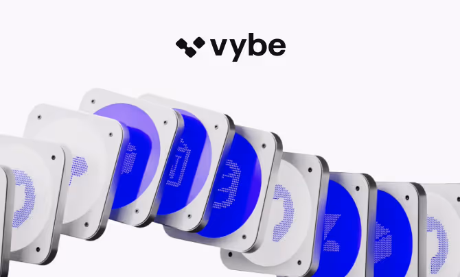
Vybe
Turn internal tools into something anyone can build.
Vybe enables teams to create secure, production-ready internal apps in seconds, using AI and their own data, removing the traditional bottlenecks between business needs and engineering capacity.
The challenge was to express a new way of building software, where speed, autonomy and security coexist, empowering both operators and engineers to collaborate on the same system.
We shaped a clear and product-driven identity, emphasizing control, flexibility and trust, reflecting a platform where ideas can instantly become real, usable tools.
The result is a positioning that reframes internal software as something fluid, collaborative and accessible, not a backlog, but a capability.
.webp)
Vizzia
Reframe public safety through a more accessible and inclusive approach.
The challenge was to position Vizzia beyond traditional security narratives, creating a brand that resonates with a broader audience while building trust across diverse communities.
We developed a clear and reassuring identity, emphasizing simplicity, accessibility and real-world impact, while highlighting a solution that can be deployed quickly and cost-effectively without heavy infrastructure.
The result is a more approachable and credible brand, making public safety tangible, understandable and widely adoptable.
Tilt Energy
Turn energy into a system that adapts in real time.
Tilt orchestrates consumption to match available energy, bringing balance, efficiency and resilience to an increasingly complex grid.
The challenge was to express an invisible and highly technical system through a clear and compelling brand, capable of making energy optimization tangible.
We developed a visual and narrative identity built around synchronization, flow and equilibrium, translating complex mechanisms into a simple and understandable language.
The result is a distinctive and future-oriented brand, positioning Tilt as a key layer in the energy transition.
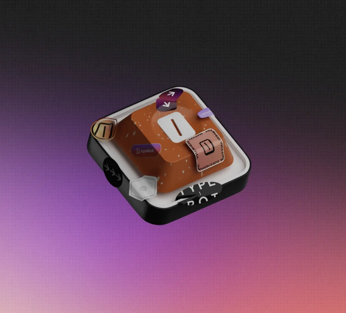
Typebot
Turn forms into conversations.
Typebot enables teams to build interactive chat experiences without code, transforming static forms into dynamic flows that capture data, qualify users, and drive engagement.
The challenge was to position the product beyond traditional form builders, expressing a more natural and performant way to interact with users.
We shaped a clear and intuitive identity, reflecting a system built around fluidity, modularity, and real-time interaction.
The result is a product that feels immediate and conversational, positioning Typebot as a new standard for capturing and understanding user intent.
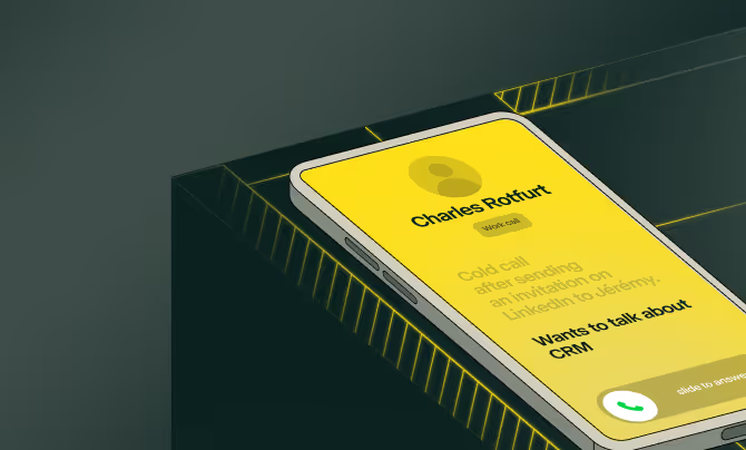
Allo
Turn conversations into structured business data.
Allo is an AI-powered phone system that records calls, generates summaries, and syncs every interaction directly into your CRM, eliminating manual work and ensuring nothing is lost.
The challenge was to position a traditionally overlooked layer of business, phone communication, as a core driver of performance and efficiency.
We shaped a clear and product-driven identity, emphasizing immediacy, reliability, and automation, turning every call into a source of actionable insight.
The result is a brand that reframes communication as data, positioning Allo as an operational layer where conversations directly translate into business outcomes.

Alpha Star
Partner with founders shaping the future.
Alpha Star is a long-term investor backing visionary entrepreneurs from the earliest stages, combining capital with deep strategic involvement across every phase of their journey.
The challenge was to express a different pace of investment, one rooted in conviction, patience and long-term commitment rather than short-term performance.
We shaped a brand that reflects this philosophy, balancing depth and clarity, positioning Alpha Star as a reference partner rather than a traditional fund.
The result is a distinctive presence that aligns capital with vision, supporting founders not just in building companies, but in shaping lasting impact.
Bonsai
Bonsai runs the business behind the work.
Built as an all-in-one operating system for freelancers and teams, it centralizes everything from proposals to payments, projects to reporting, in one seamless flow. No more scattered tools, no more manual overhead.
We redesigned the visual identity and website to elevate the brand, making the product feel more premium and almost tangible. A system shaped around clarity and control, removing friction from the back office so people can focus on what actually matters.
More than a tool, Bonsai reframes freelancing as a structured, scalable business.