

.avif)


.avif)
.avif)


.avif)
.avif)


.webp)


Strategy, Copywriting, Brand Identity, Design System, Motion, Illustration, Website, Integration
Everyday is a mobile game studio exploring how AI can reshape play experiences. In a saturated market, it focuses on designing engaging games that players return to regularly, aiming to create simple experiences that become part of everyday life.
Create a brand that reflects the idea of daily engagement and positive routine.
Position the studio as both creative and technology driven, combining playful experiences with AI powered innovation.
Design an identity that expresses energy, optimism, and consistency while remaining simple and memorable.
The brand is built around the idea of daily presence.
The sun becomes the central symbol. It represents rhythm, renewal, and the positive energy people encounter every day.
Through this metaphor, the identity connects gaming with a small but meaningful daily ritual.
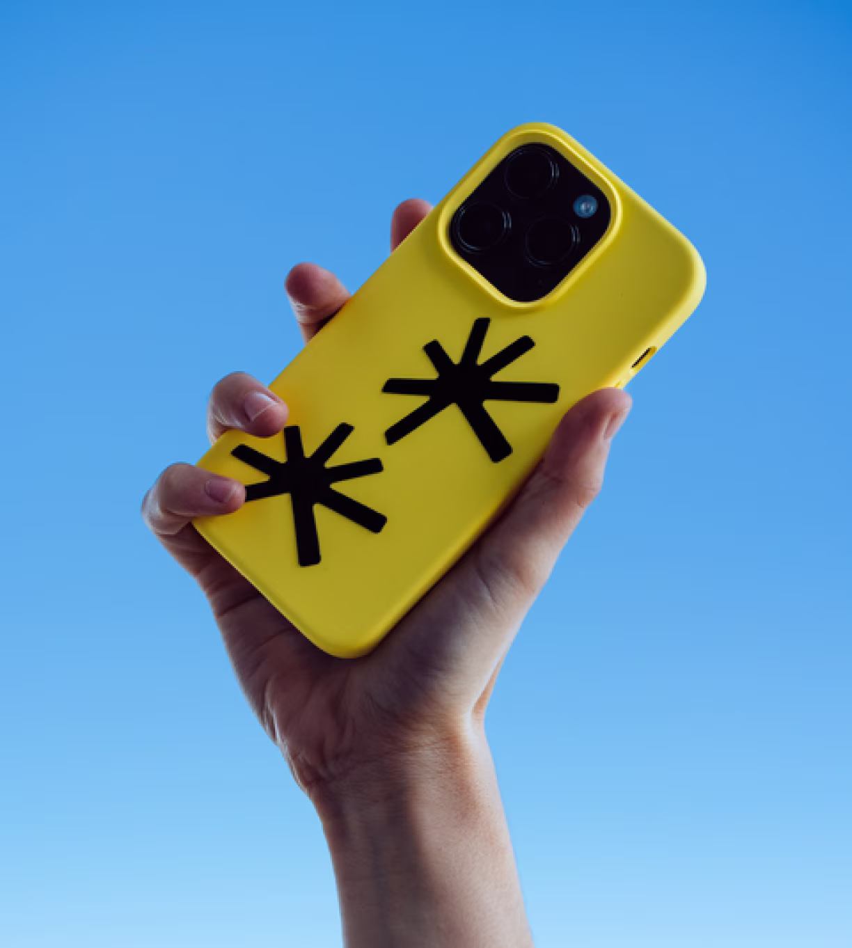
The logo draws inspiration from solar symbolism.
Its radial composition evokes light, movement, and energy, forming a dynamic mark that reflects the rhythm of daily play.
The imperfect circular arrangement introduces motion and vitality, reinforcing the idea of games that evolve and remain engaging over time.
The identity establishes Everyday as a studio focused on joyful and recurring play experiences.
By combining a clear symbol with a simple narrative, the brand communicates consistency, positivity, and creative momentum.
It positions Everyday as a studio designing games players want to return to every day.
The Everyday brand is built around the idea of the sun. A symbol of renewal, rhythm, and daily presence.
This reflects a simple ambition. Creating games people come back to every day. Not occasionally, but as part of a natural routine.
The identity was therefore designed to live across multiple contexts. Flexible, expressive, and capable of adapting to every moment of use.
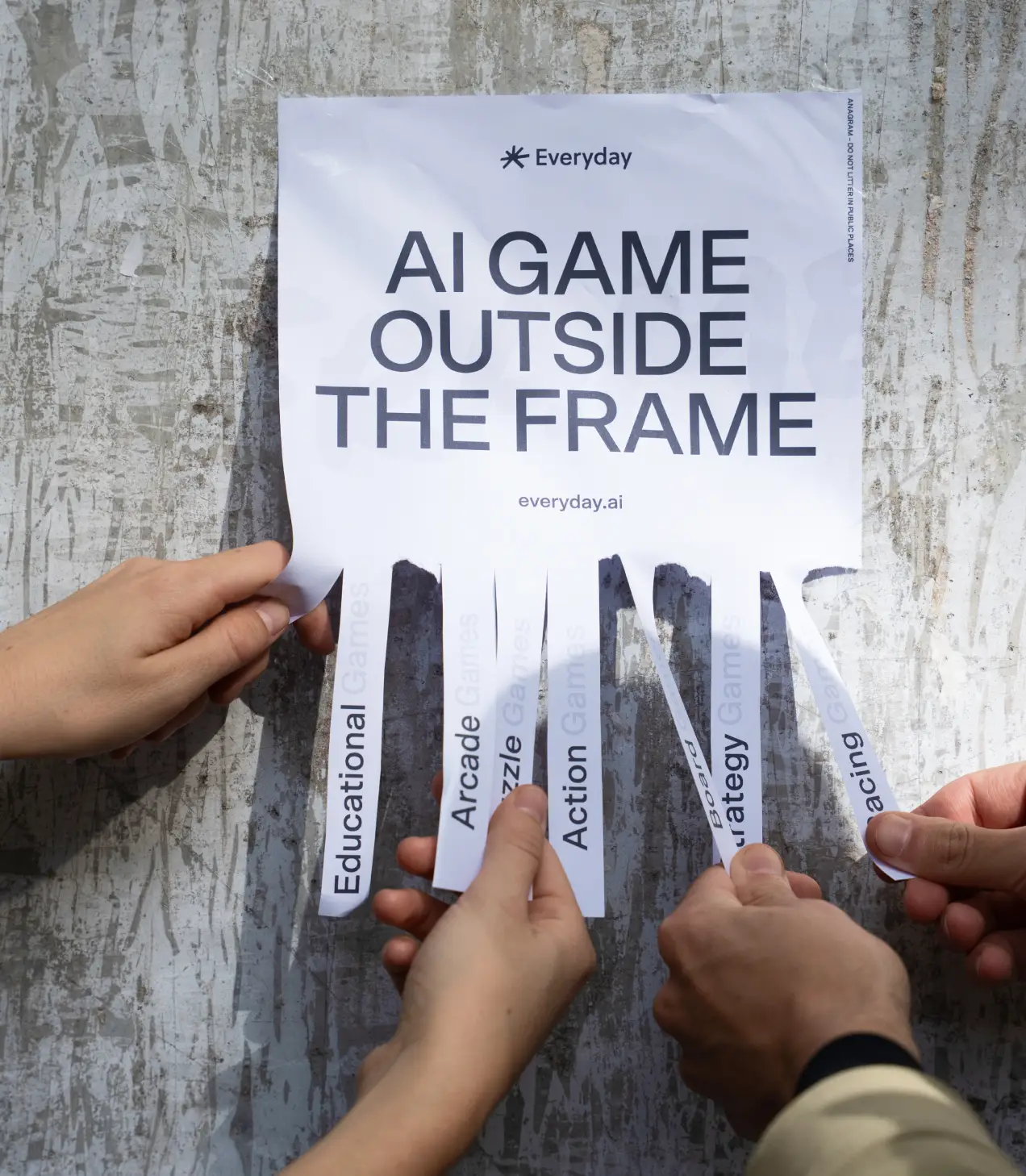
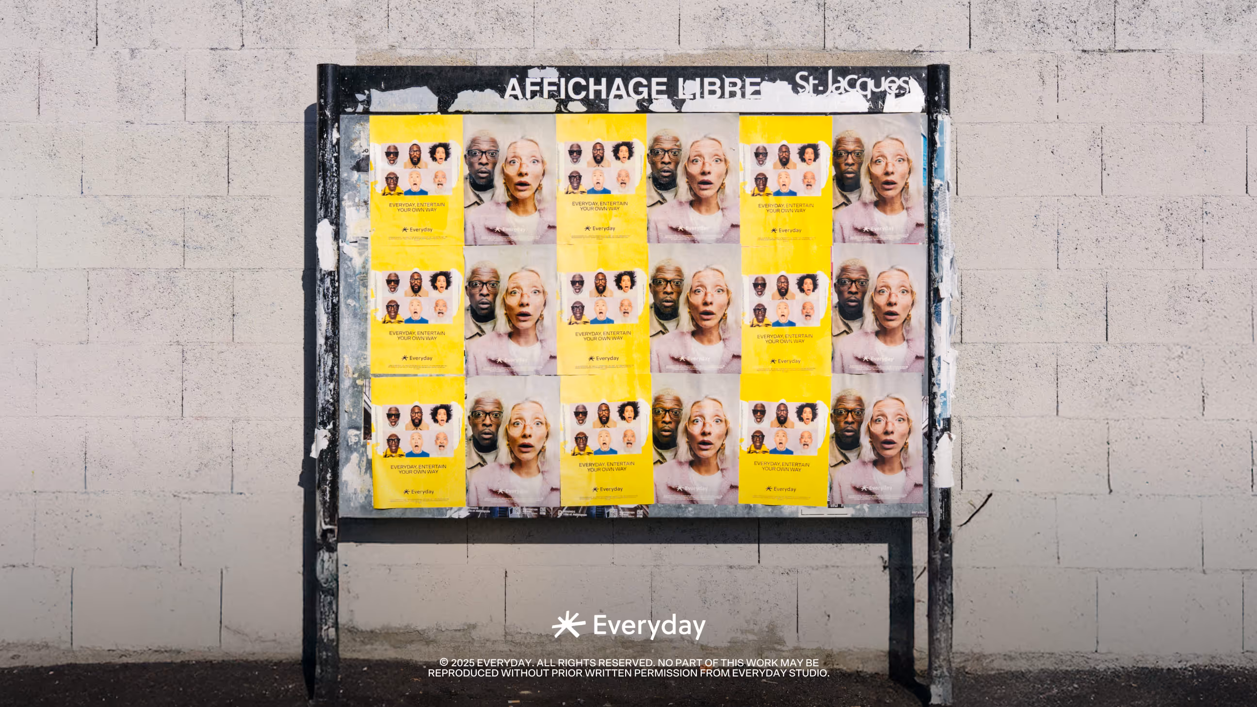
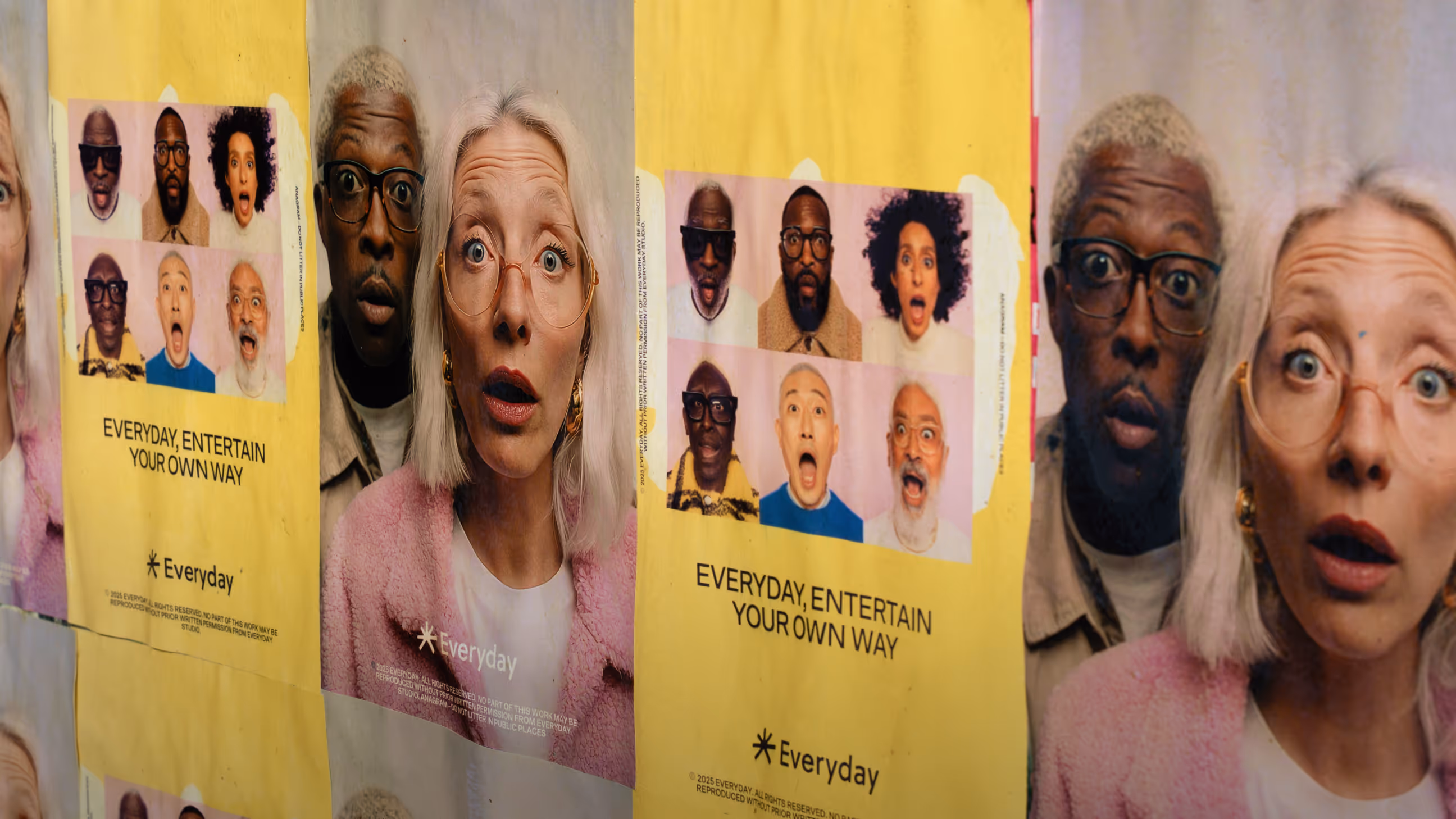
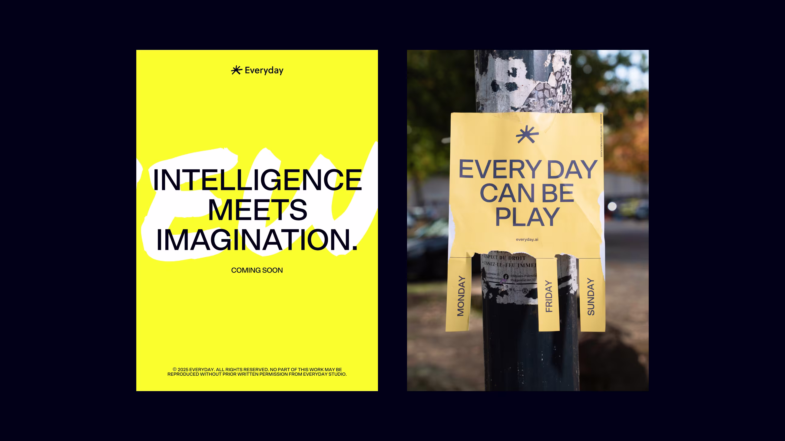
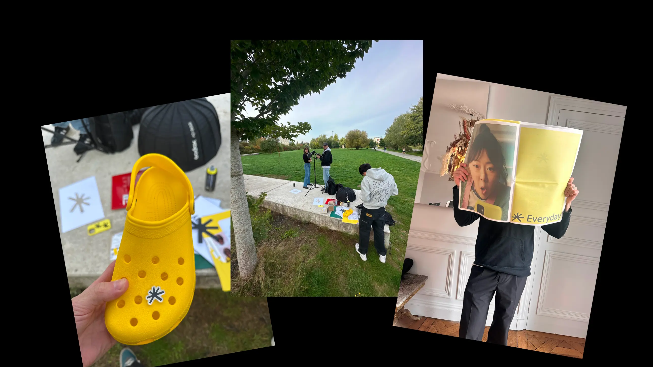
We chose to bring the brand directly into real life environments.
The goal was to express its entertainment value while showing that Everyday is not confined to screens. It exists beyond them.
Games become something you can carry with you. In the city, at any time, as part of everyday life.