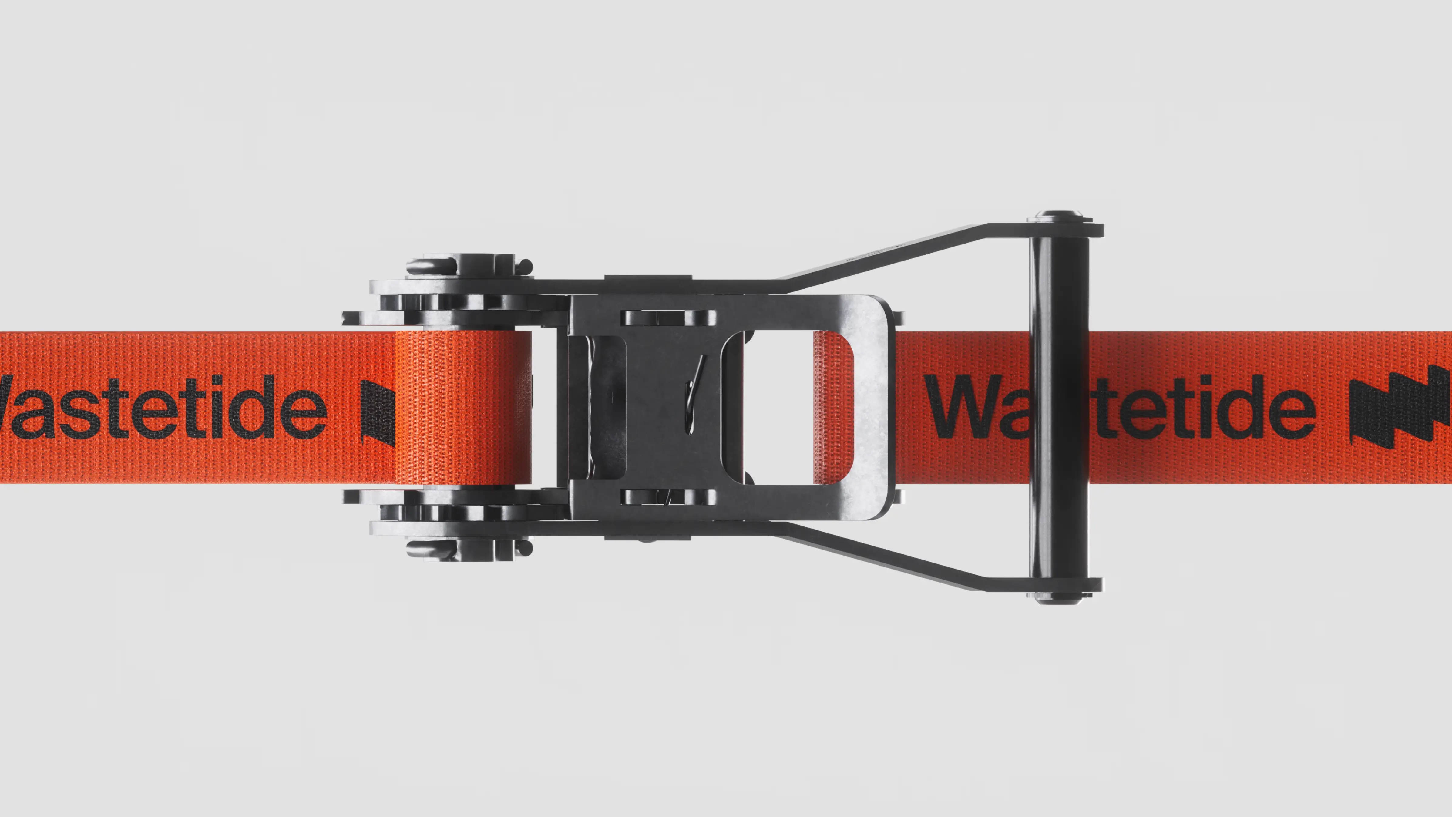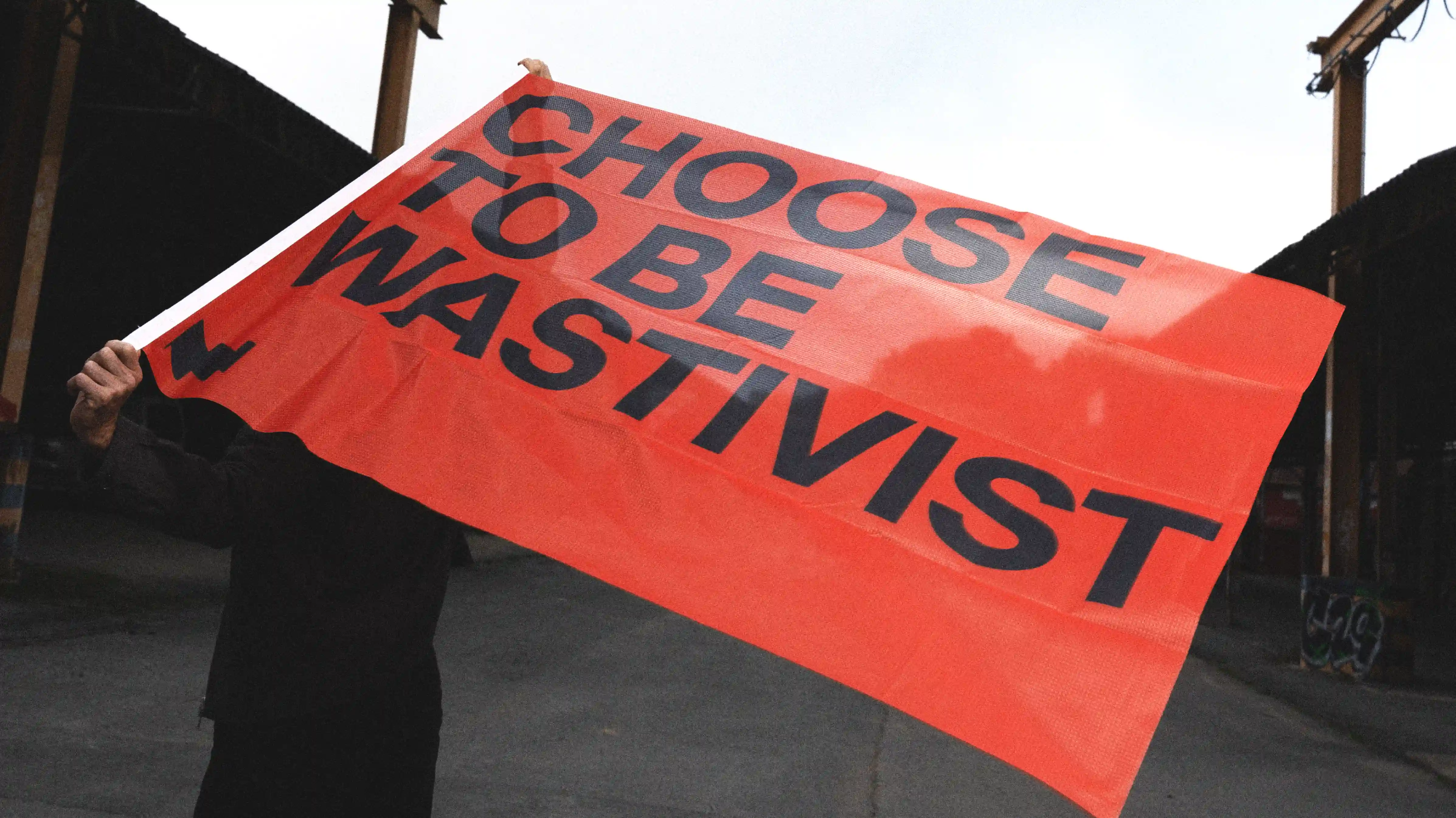
The flag represents identification and discovery the ability to locate hidden opportunities within industrial waste streams. The wave symbolizes the tide, a continuous flow of materials, resources and transformation.
The ascending line embodies progress, growth and the creation of value over time. Combined with the initial "W", these elements merge into a single mark that captures Wastetide's core promise: turning overlooked waste into measurable opportunity. More than a logo, the symbol acts as a visual equation a synthesis of detection, transformation and value creation.

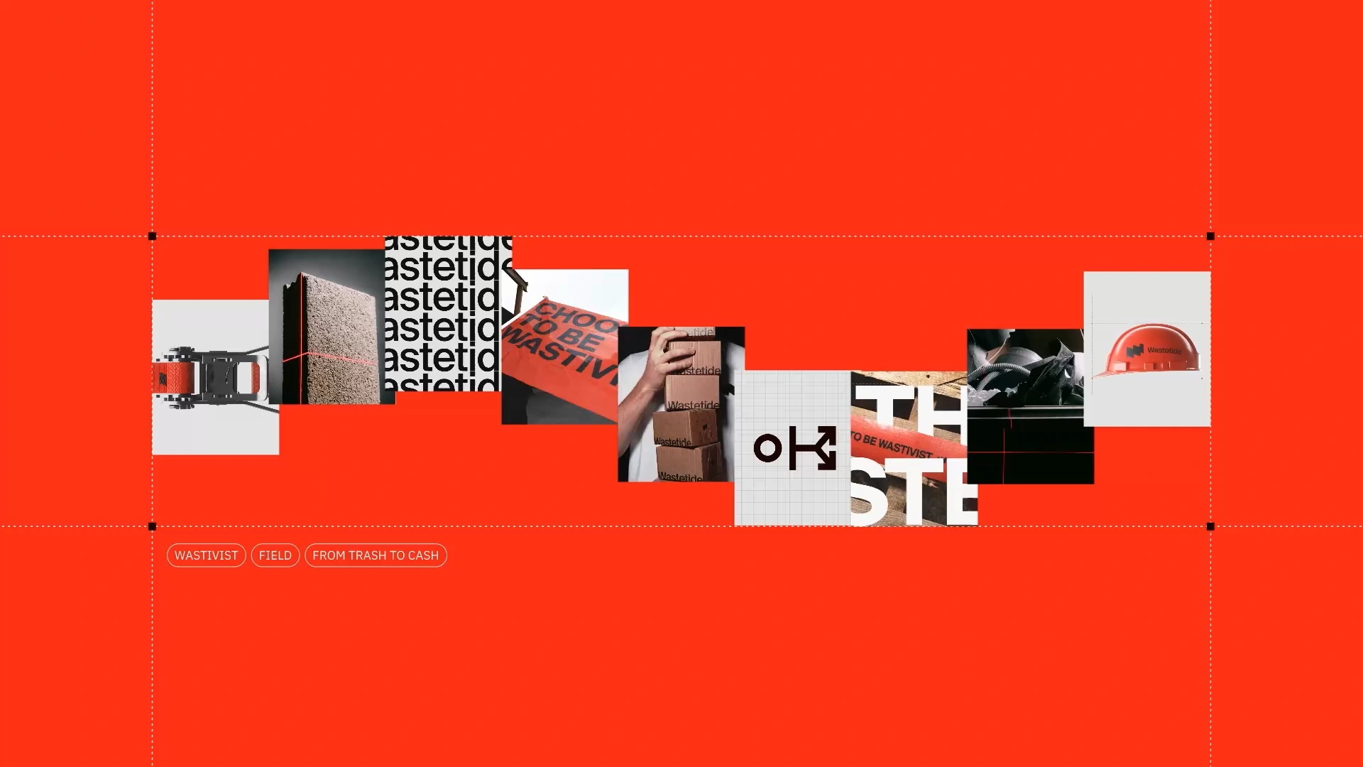
The identity is built around three core principles.
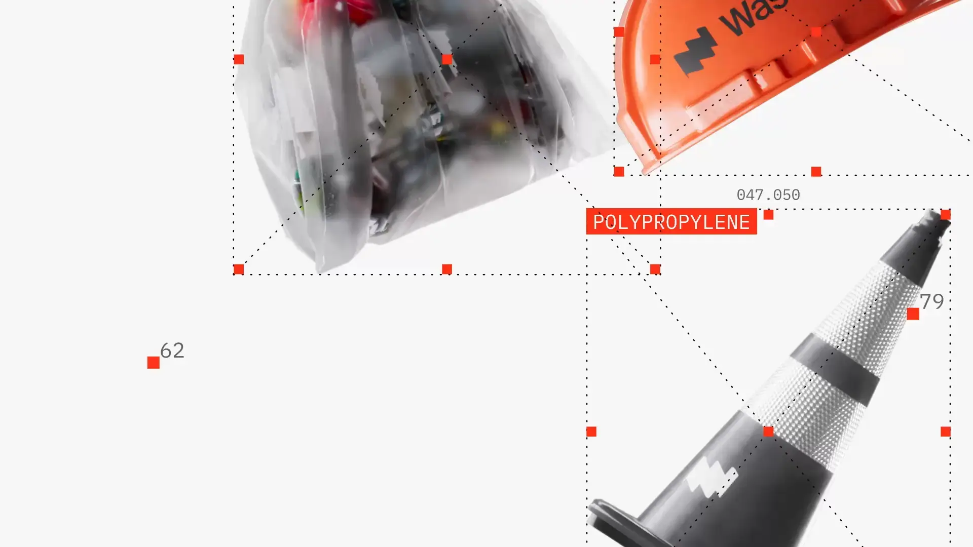
The iceberg represents the contrast between visible waste and the hidden value it contains, whether in the form of materials, data or economic opportunities.
The wave symbolizes a shift in perspective. It embodies movement, awareness and the transformation of waste into a resource.
The segmentation system draws inspiration from paper-cut techniques. By slicing and revealing different layers, it reflects the analytical process used to understand waste composition and uncover its potential.
Together, these principles form a visual language centered on exploration, understanding and value creation.